sept 2020 - may 2026

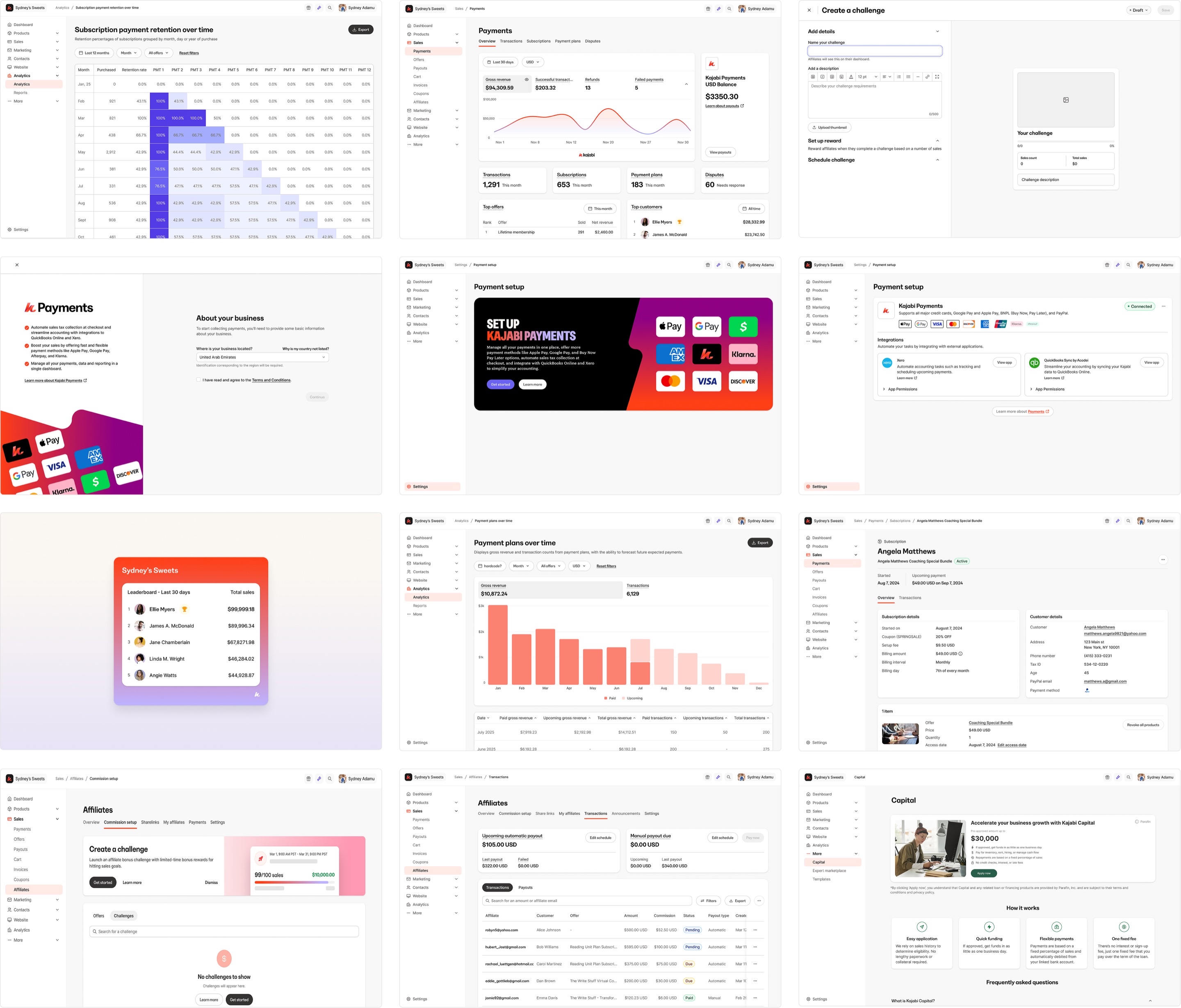
oct 2025 - may 2026
checkout: upsells
Context & Role
Kajabi gives creators everything they need to sell courses, coaching, memberships, and digital products in one place. Upsells are a key revenue lever, but the experience hadn’t been updated in years. The generic template with limited customization made the upsell feel disconnected from a creator’s brand at a critical moment → right after checkout.
The revamp introduced real customization: fonts, colors, and styling alongside a rebuilt creation flow and new analytics. Beta ran from March 2026, followed by GA in April.
I was the solo designer, owning the end-to-end experience for creating upsells, linking them to offers, and customizing the upsell page. I also shipped three rounds of UI polish. I wasn’t originally staffed on the project. I took it on top of my payments work after the checkout designer transitioned off the team.
10.88%
Average conversion rate
$256K
Total GMV
2,149
Upsell purchases
*Metric reflects one month of beta data. Figures have very likely shifted since.
The redesigned buying experience customers see at checkout.
Problem
-
Limited customization.
Outdated, generic templates made upsells feel disconnected from a creator’s brand, limiting their ability to create a compelling post-purchase experience and optimize for conversion and AOV.
-
Creating upsells was tedious and repetitive.
Upsells weren’t reusable. Creators had to manually create a new upsell from an offer each time, making it time-consuming to maintain and scale their upsell strategy.
-
No performance visibility.
There were no upsell-specific analytics, leaving creators without visibility into conversion or revenue impact and no clear way to understand what was working.
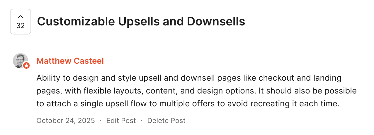
Quote from our customer on limited customization and manual process.
Key decisions
-
Redesign the upsell template to match the creator’s brand.
The existing upsell page relied on a rigid, generic template, with limited customization, that made it look disconnected from the rest of a creator’s site. I redesigned the template with updated controls that gave creators meaningful control over the page, including layout, typography, colors, imagery, content, and sections. Rather than adding a long list of one-off settings, we brought the upsell experience into the same flexible Builder model creators already use elsewhere in Kajabi.
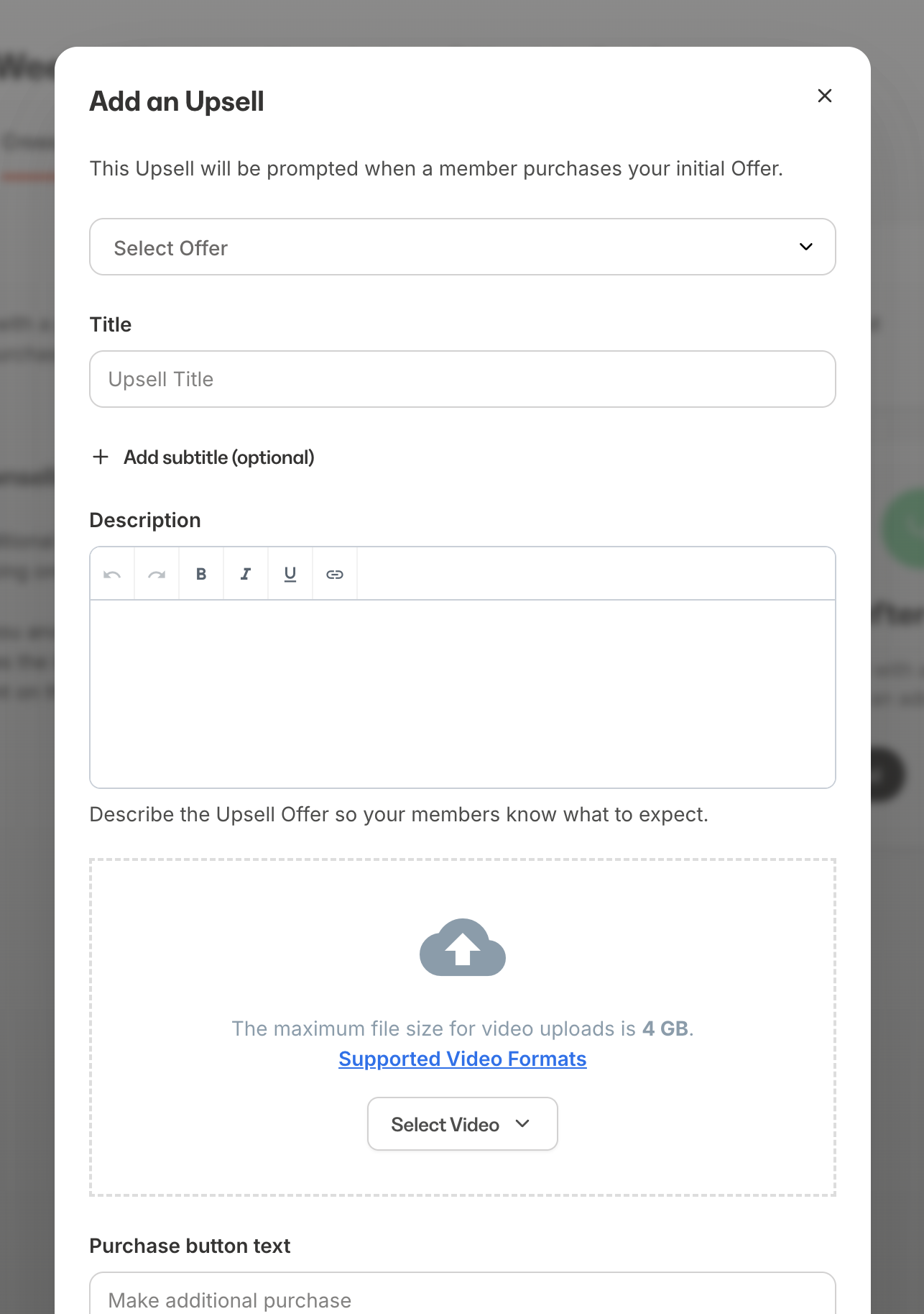
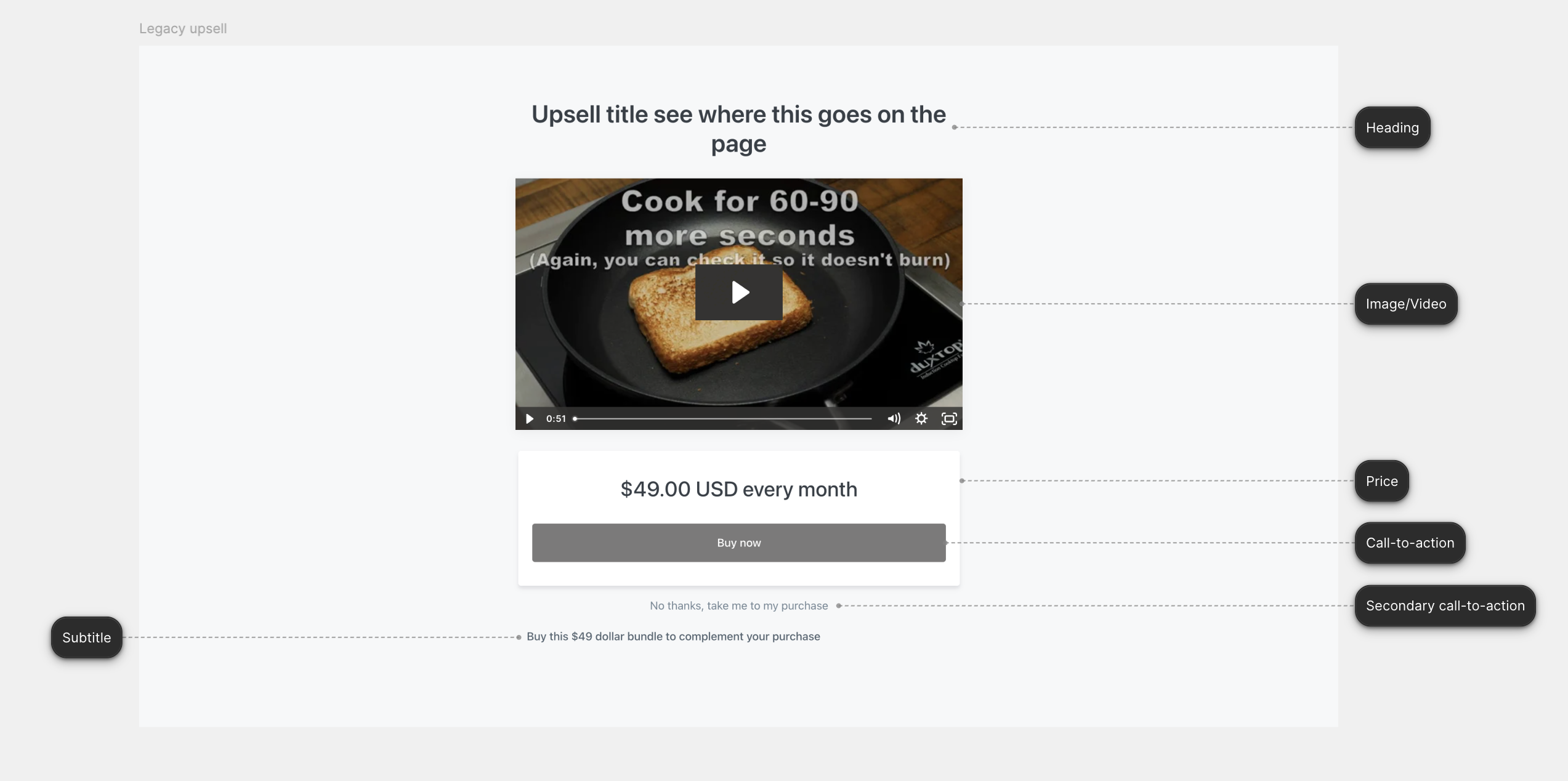
On the left is current upsell creation experience. The one next to it is the upsell page customers see, with annotations pointing to what the controls map to.
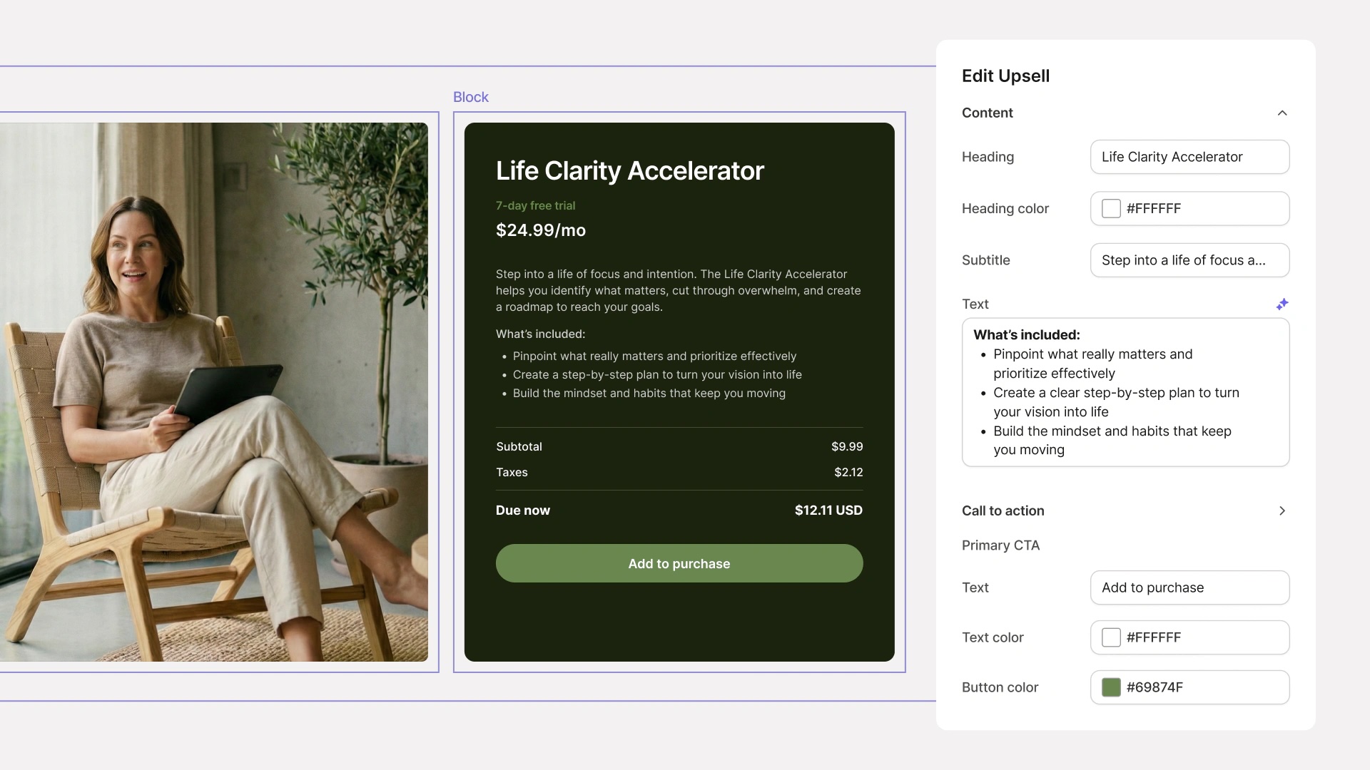
The updated, modernized upsell page with branding already applied and additional customization options if creators want to customize further.
Key decisions
-
Make upsells reusable.
Previously, creators had to recreate an upsell for each offer. We separated the upsell from the offer so creators could create it once and reuse it across multiple offers. This also meant changes could be made centrally and automatically reflected wherever the upsell was used, making the system easier to maintain and scale.
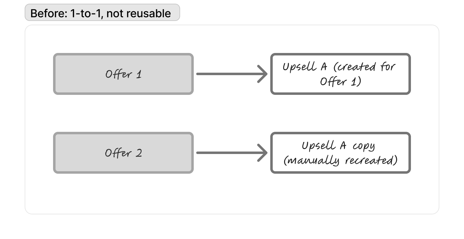
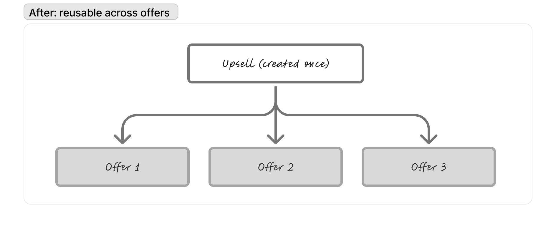
Key decisions
-
Give creators visibility into performance.
An upsell is only useful if creators can understand whether it’s working. We added purchases, conversion rate, and revenue at both the overall and individual upsell level, giving creators a way to measure performance and iterate on their offers.
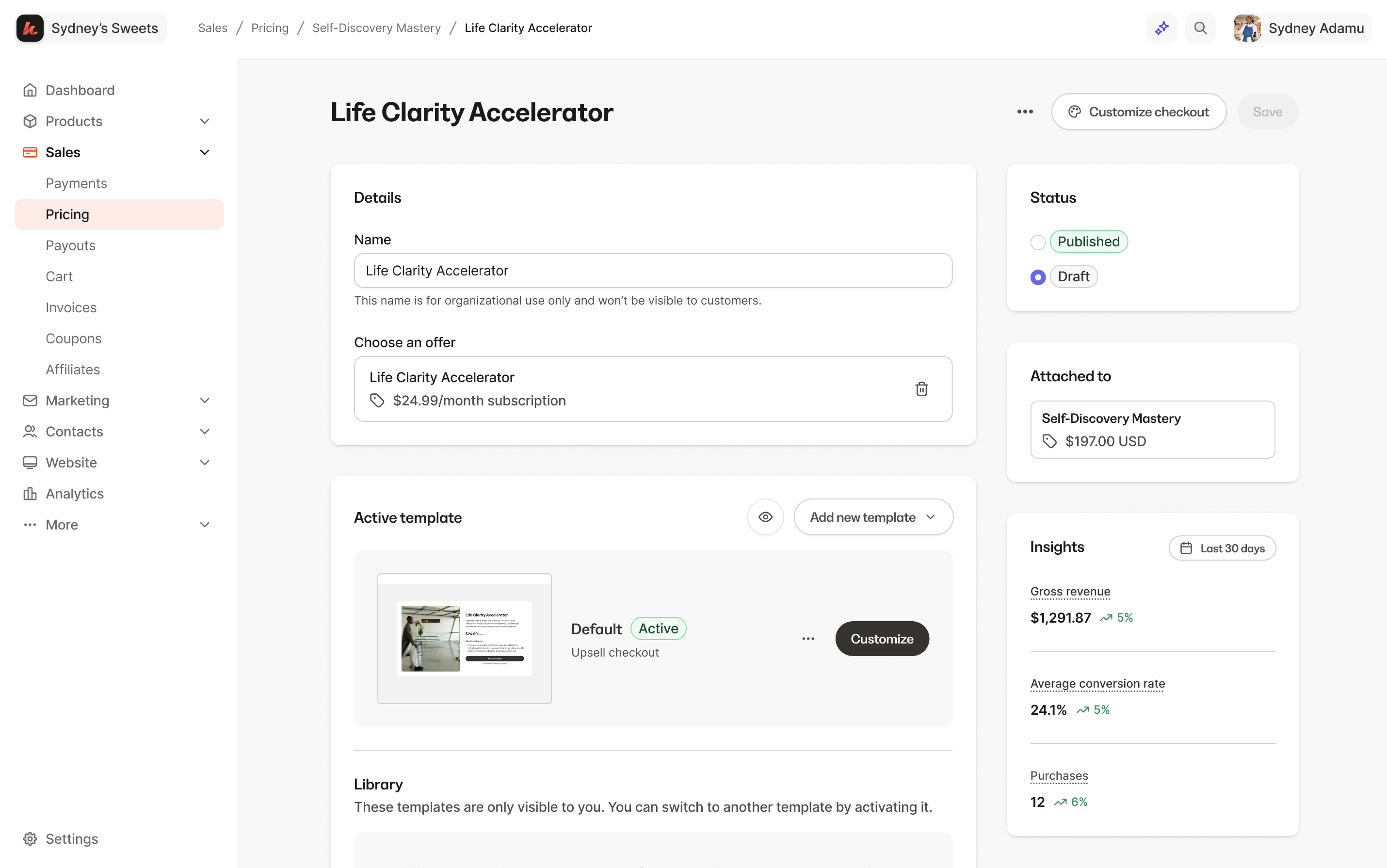
An individual upsell page where we now surface metrics such as purchases, conversion rate, and revenue.
Key decisions
-
Call the experience “Upsells”.
The biggest challenge in this project was landing on the correct verbiage for the upsell creation experience as it relates to Offers. We explored several naming directions, including “Upsells & Downsells” and “Post-Purchase Offers”. After some debate and back-and-forth, we landed on “Upsells” because it was the most familiar term for creators. This simplified the mental model, but meant treating downsells as a use case of the same page rather than a separate page type. The tradeoff that we made is de-emphasizing the distinction between upsells and downsells upfront. We assumed creators would use the same reusable page for both, giving us a more flexible system that could eventually support an upsell funnel builder—where the same page can function as either an upsell or downsell depending on where it appears in the funnel.
Final design where we landed on Upsells and also bundled Offers and Upsells under the new umbrella → Pricing.
Outcome
- 10.88% conversion rate. More than 1 in 10 presented upsells converted, with a 12.71% conversion rate at the first upsell step and 4.29% at the first downsell step.
- $256K GMV in the first month. The new experience processed $256,237 in GMV within its first month, with an average accepted upsell value of $123 and downsell value of $58.
- 10,639 accounts enabled. The experience reached 10,639 accounts across 15,708 sites, representing 60% of accounts with at least one upsell.
- 28K+ upsells migrated or created. Creators migrated or created 28,233 upsells, with 17,487 actively published.
- Attach rate continued to grow post-launch. Upsell attach rate increased from 2.09% to 2.50% between March and June, a 0.36 percentage-point increase YoY. Combined upsell + downsell attach rate reached 2.63%, up 0.39pp YoY.
- Revenue continued to grow YoY. Upsell GMV reached $8.7M YTD, up 11% YoY, while downsell GMV reached $331K, up 28% YoY.
Reflection
This project was a strong example of what’s possible when design and engineering collaborate closely from the start. Aside from our Commerce squad, we also got help from another engineer in Kajabi who had deeper expertise in Kajabi’s themes and templates, which helped us navigate the technical complexity of the template redesign.
I also pushed myself beyond the typical designer role by diving into the code and learning how to contribute to production PRs. Working directly with engineers taught me better practices for structuring, reviewing, and shipping UI changes, and gave me a much stronger understanding and empathy of what it takes to bring a design from Figma into a production system.
The strongest signal for me was that the product continued to gain traction after launch, not just through the initial migration, but through steadily increasing attach rates. That reinforced that the redesign wasn’t simply a visual refresh; it created an experience creators continued to use and build on.
Overall, the project reinforced how much stronger the work becomes when design, product, and engineering are solving the problem together. It also gave me more confidence working directly in the codebase and thinking about the full path from design decision to shipped product.
jan 2025 - may 2026
checkout: order bumps
Enabled order bumps at checkout to lift average order value.
Context & Role
Kajabi’s checkout order bumps let creators offer add-on products right on the checkout page, before purchase. As the solo designer on the Commerce team, I took this on following the upsells work and redesigned both the creator setup/linking flows and the buyer-facing experience.
+40%
Average bumps per attaching order
+45%
Bump revenue at checkout
+26%
Average order value
Problem
-
Order bumps was limited to just 1 at checkout. Creators sell in bundles (a course plus a workbook, a template pack plus a coaching call), but checkout only allowed a single order bump, so they couldn’t merchandise the way they actually sell. For every checkout that doesn’t leverage the add-on features real GMV is being left behind.
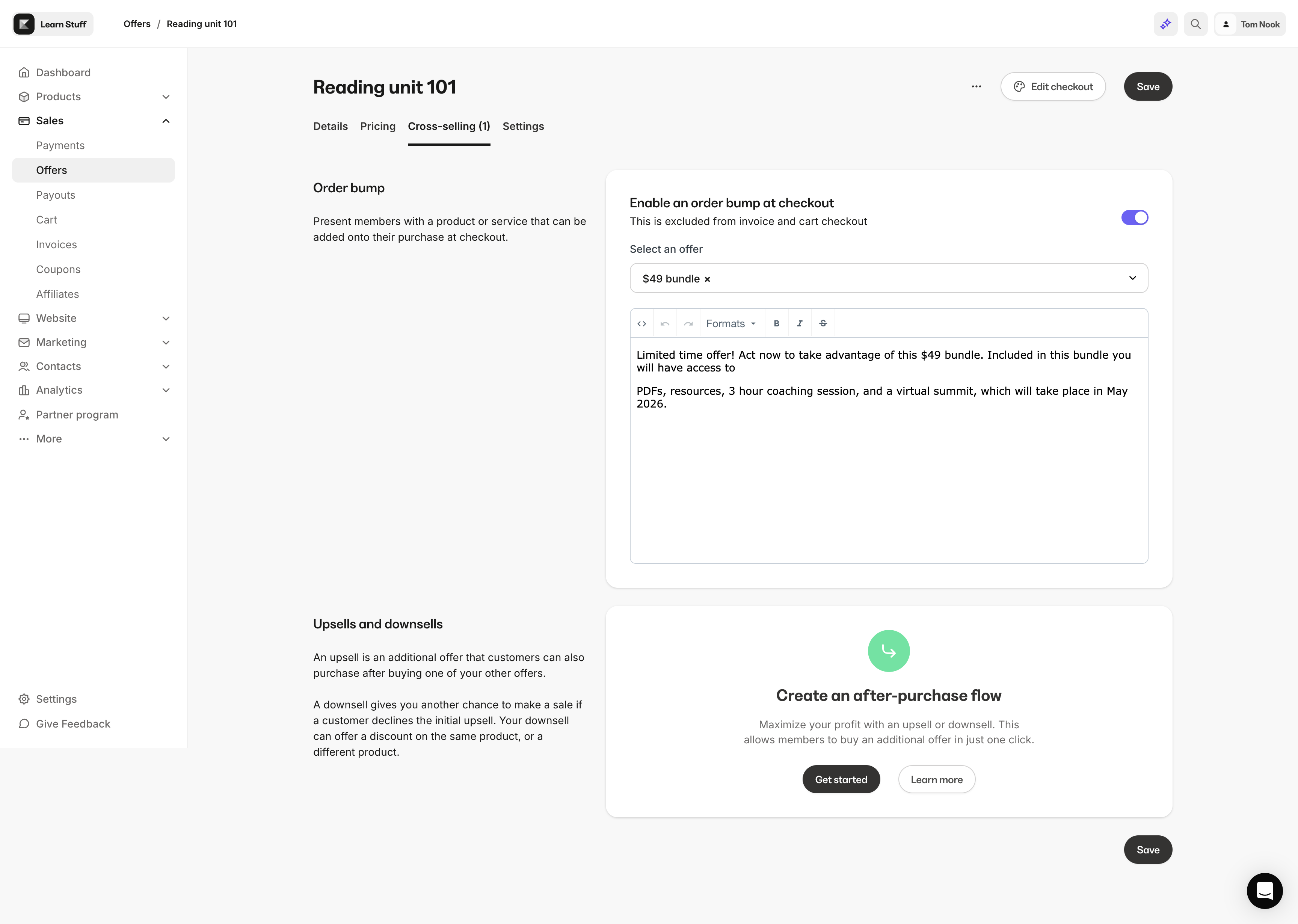
Current order bump configuration: Only one bump is allowed, with limited customization to the description, not the image.
-
Customization was limited. Since an order bump is an offer attached to checkout, creators wanted to customize its image for each instance without changing the original parent offer.
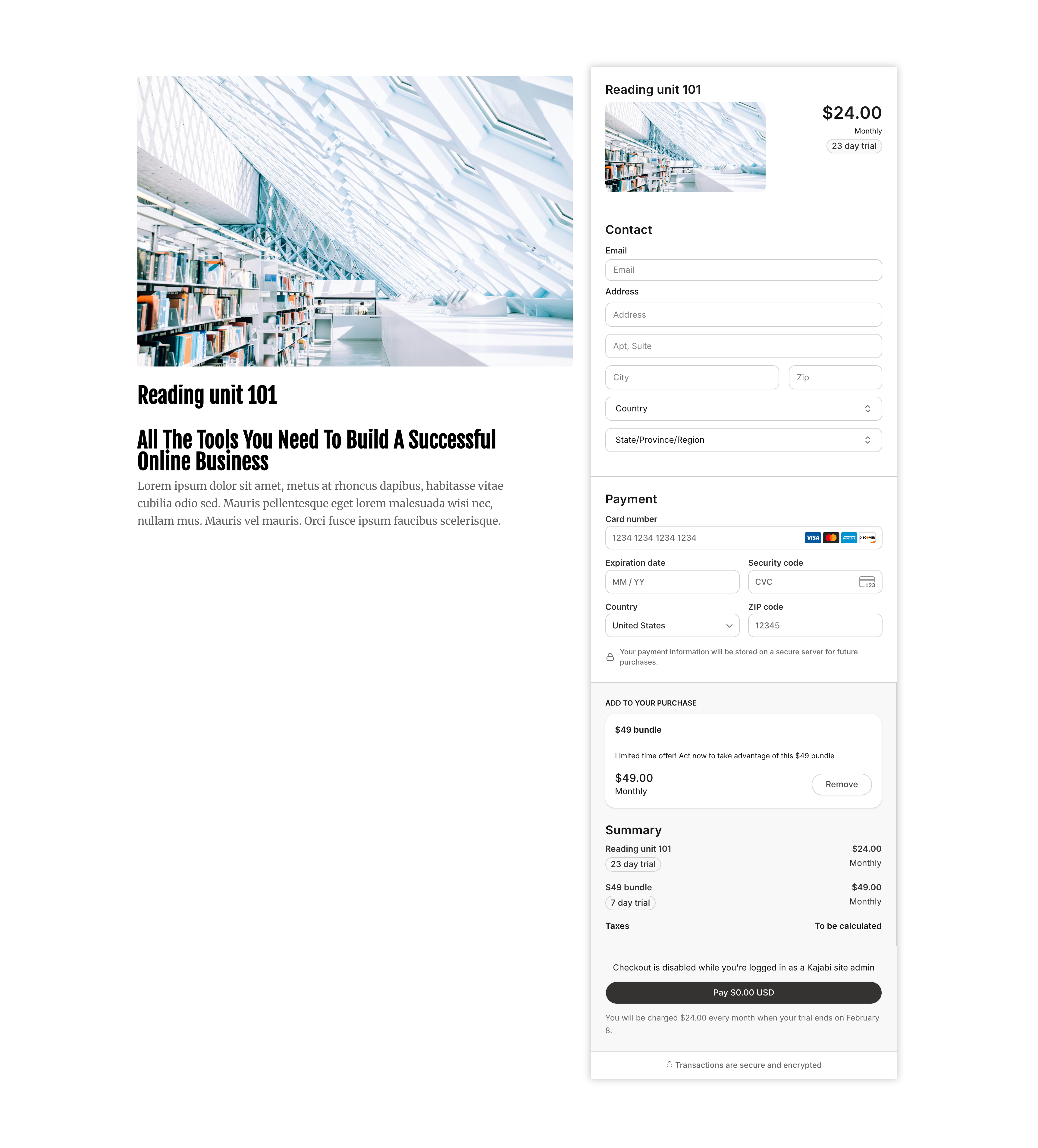
Production checkout with order bump enabled: Typography and visual hierarchy are lacking.
Key decisions
-
Bet on basket depth, not conversion.
We allowed 2+ bumps per checkout, betting that the real lever was basket depth rather than reach. The data backed it: attach rate moved only modestly (23.2% → 25.0%, +1.9pt), but bumps per attaching order jumped from 1.00 to 1.41 (+40%), and average bump revenue at checkout rose from $31 to $45 (+45%). When a multi-bump offer converts, buyers take more than one, so the feature is working exactly as designed.
Final design showing the adding of order bumps at checkout.
Key decisions
-
Reorganized the information architecture to give order bumps a proper home.
After the Upsells work shipped, the “Cross-selling” tab was renamed “Purchase flow” and grouped Upsells, Post-purchase, and Automations together. But that grouping didn’t actually fit order bumps — bumps live entirely within checkout, not in the post-purchase flow the rest of that tab was organized around. I went ahead and restructured the information hierarchy for offers as a whole, so that creating an offer felt intuitive and order bumps had a home that matched where they actually function, not just where they were originally filed.
Order bumps now grouped with Checkout.
Outcome
- +40% increase in average bumps per attaching order. Bumps per attaching order went from 1.00 → 1.41.
- +45% bump revenue at checkout. Average bump revenue at checkout went up from $31 → $45.
- +26% average order value. For 2+ bumps with at least one recurring offer, the average order value went up from $144 → $181.
- Attach rate increased 1.8pt from 23.32% (single) → 25.0% (2+ bumps).
Reflection
Due to dev resourcing and scope constraints, we weren’t able to implement the information architecture changes as I had proposed. It was deprioritized to a later phase, once there’s a clearer business case to justify a broader UX overhaul of the information architecture rather than a narrower, order-bumps-specific fix. The next step I’d advocate for is building the business case directly: running a usability test or pulling quantitative data comparing offer creation before and after a restructured information architecture. That would let us show concretely how much the flow simplifies, and how much faster a returning user can create an offer compared to today. With that evidence in hand, it becomes much easier to justify prioritizing the broader IA overhaul rather than tacking it to an order bump project.
apr 2026
media library
AI-prototyped concept for managing custom Media Library views.
Built using V0 to demo the micro-interactions for creating, saving, removing, and deleting views.
jan - sep 2025
affiliate payouts
Context & Role
I owned the 0→1 end-to-end design of Kajabi’s new affiliate payouts system, partnering with PM and Eng on the discovery, design, and launch in Sep 2025. Business driver: 2025 strategy to grow GMV - 22% of customers ran affiliate programs but only 6% used Kajabi’s built-in feature (~$130M off-platform GMV opportunity).
A brief context on affiliate programs: Kajabi heroes (our customers) run affiliate programs to promote their courses, drive more sales, and reach new customers. The affiliates in exchange receive commission, which in turn creates an effective, performance-based marketing channel with low upfront cost.
As of 2023, 22% of the customer base (12k) is running an affiliate program, but only 6% of 22% of heroes are utilizing Kajabi’s affiliate feature. In 2023, Kajabi heroes processed 15M in commissions for their affiliates on a 52M gross payments volume. It is estimated that we could bring in approximately $130 million in additional off-platform GMV onto Kajabi by revamping affiliate payouts and automating the manual workflow.
9%
Growth MoM
$400K
Paid commissions
$4.3M
Total GMV
Snippet from the marketing video for the Sep 2025 launch.
Research
To understand the domain, I initiated a mind-mapping exercise with my PM in December, before we kicked off the project in January. We basically put everything we knew about affiliates onto a whiteboard, which helped me map out the current workflow and identify areas where we needed to do more research.
The journey of setting up the affiliate program looked like this: they start off with affiliate registration, create a landing page to promote their program then qualify them using our survey tool. After the affiliates join the program, they then set up share links and coupons for the affiliates to use. They would announce via Kajabi’s email campaigns or Facebook posts about a new campaign that they’d like affiliates to participate in. The last step is commission reconciliation, which required the customer to manually track the commissions, account for outside bonuses, refunds, failed payments, usually waiting 60 days or more, download the PayPal Mass Payout report, then uploading it to PayPal, which then sends the payments to the affiliates. We are targeting this segment of the customer journey in this project and looking to automate it for customers.
Affiliate registration
- Create a landing page aka “Affiliate signup page”
- Qualify affiliates based on audience or register them manually
Set up commissions
- Set up share links and coupons for affiliates to use
Incentive affiliates
- Announce via email campaigns or Facebook posts about a new campaign or bounty program
Commission reconciliation
- Track and edit commissions
- Account for errors or outside bonuses and prizes
- Usually wait at least 60 days b/c of potential refunds
- Upload PayPal Mass Payout report to PayPal
- PayPal will send automatic payments to affiliates
Even though this was a comprehensive journey mapping of the end to end workflow for a customer running an affiliate program, and may seem like unnecessary since for this project we are only looking at payouts, but this exercise was helpful for me to quickly get ramped up on affiliates, share the knowledge with key stakeholders, gain empathy, and provided a foundation as we looked into other affiliate projects, which was also done during the same time we were working on payouts.
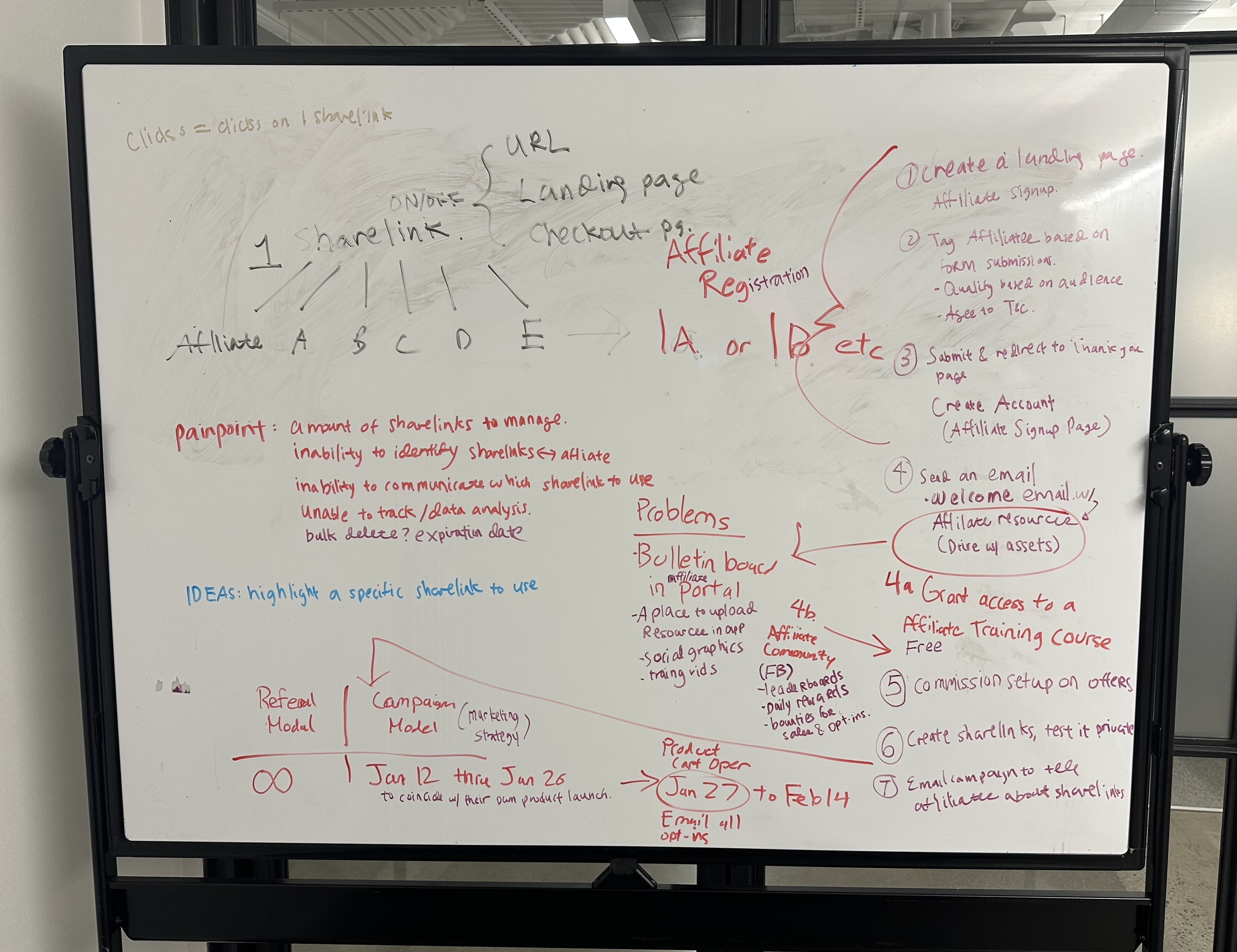
Front of the whiteboarding exercise on the current affiliate workflow.
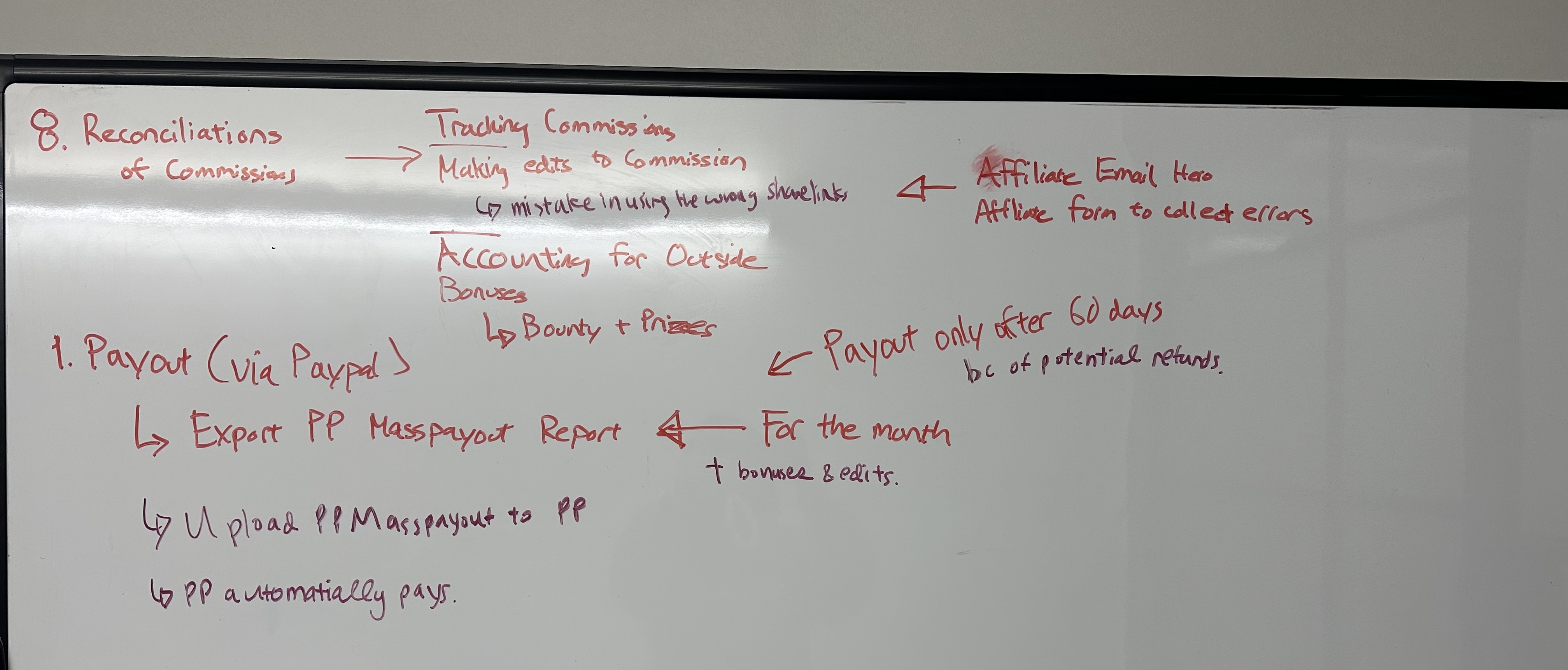
Back of the whiteboarding exercise on the current affiliate workflow.
Problem
-
Current process is manual and labor intensive: Creators had no way to efficiently manage payouts. Current process required them to double check the affiliate email and transaction amount and then submit a mass payout excel sheet via PayPal.
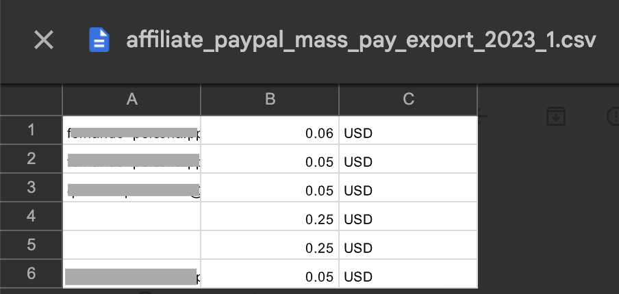
Example report customers download today, then cross-check against transactions manually.
-
Customers prefer to have both Manual and Automatic payouts, to have more control over how they like to pay their affiliates the commission.
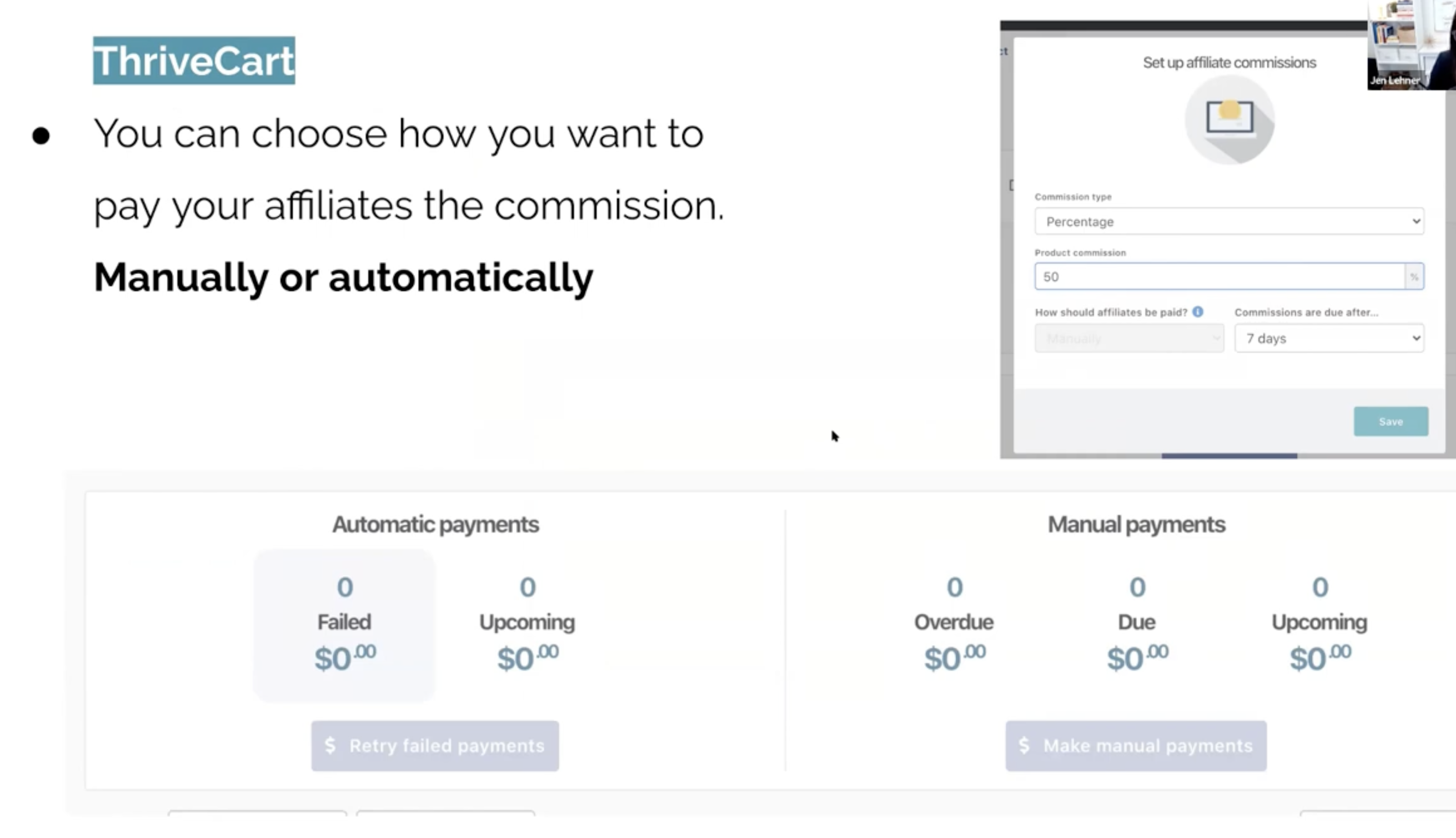
Screenshot of a customer walking through a competitor’s payout feature
-
A large number of Kajabi heroes pay out their affiliates on a designated date of the month.
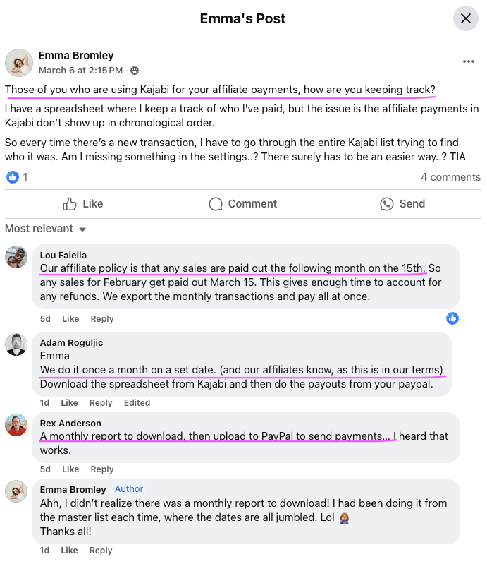
Insights from a customer thread on Facebook on how they keep track of affiliate payments.
Designs
From the problem definitions, I landed on the core product components for the affiliate payouts flow:
- A system that supports both Manual and Automatic payout
- A payout flow for Manual that allows customer to cross-check transactions
- Setting a schedule for Manual
- Setting a schedule for Automatic (set payout date on a specific day of the month)
- View and export transactions and payouts
I started by designing for both manual and automatic payouts together, so the system could account for both from the start, then sequenced implementation with manual shipping first and automatic following shortly after.
For initial designs I used AI prototyping tools to do some generative brainstorming. I prompted it with the key product components and had it generate an initial affiliate payout flow. I find AI really useful for brainstorming because it gives me a quick baseline of what the product could look like. Then I can take those initial ideas, evaluate them, get feedback from stakeholders, and then dive into each component to refine the experience further.
For example, in this Process Affiliate Payouts modal, customers can have hundreds of payouts to process, so a small table within a modal isn’t going to work for that volume of information. It’s also not ideal for cross-checking transactions, because the modal can easily be closed and there’s limited space to review everything side by side.
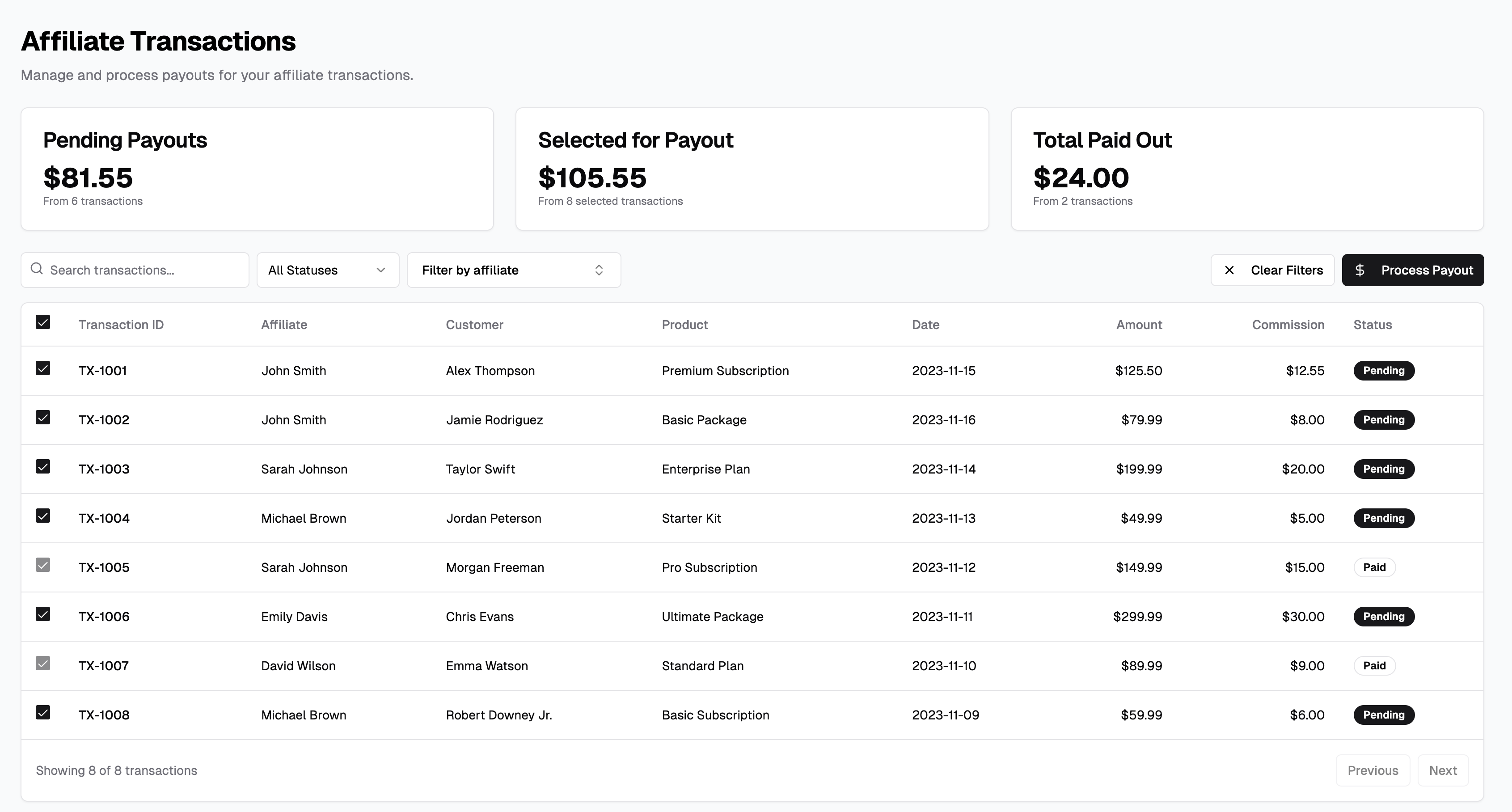
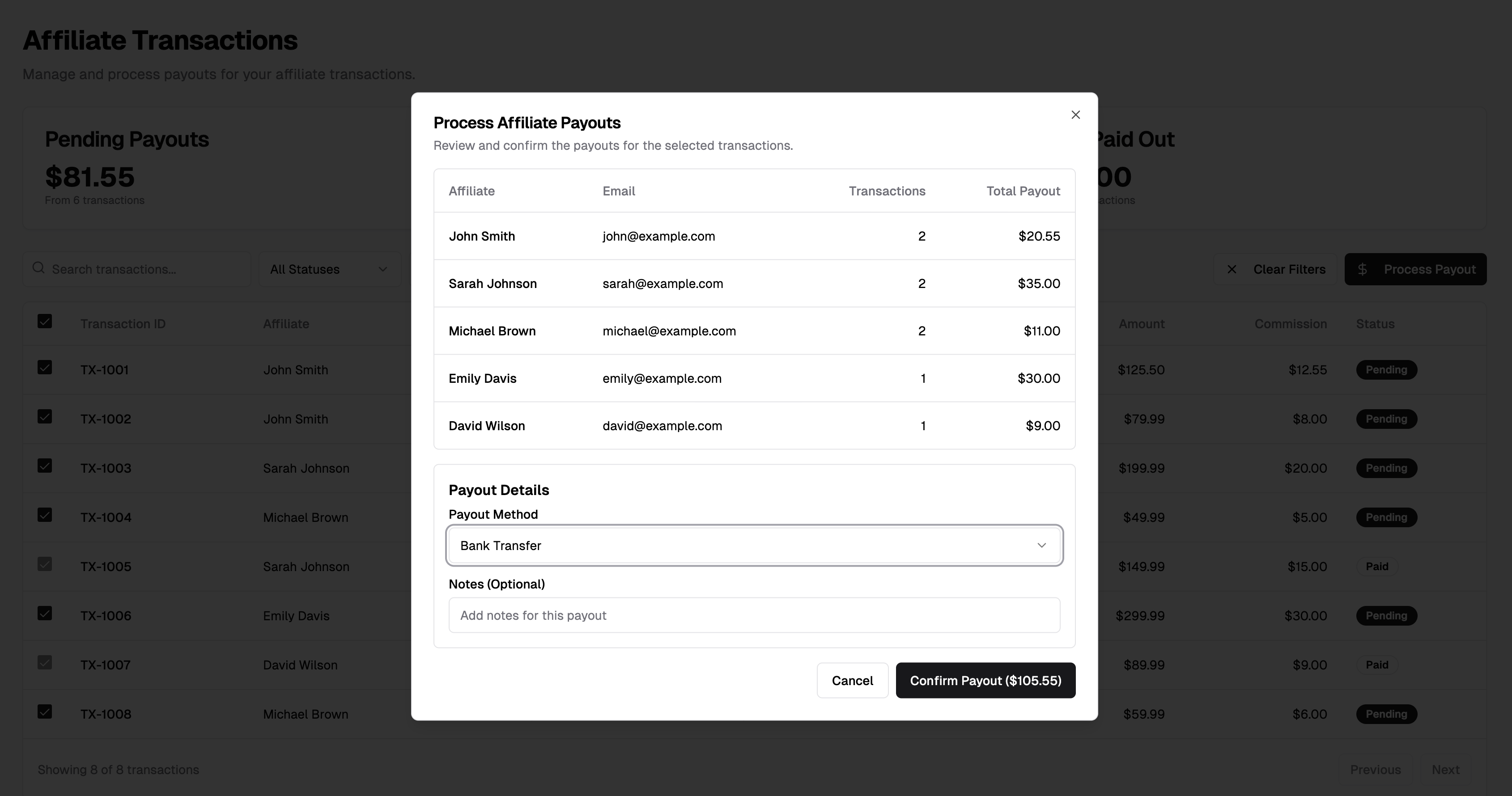
AI generated output of initial explorations based on key product components.
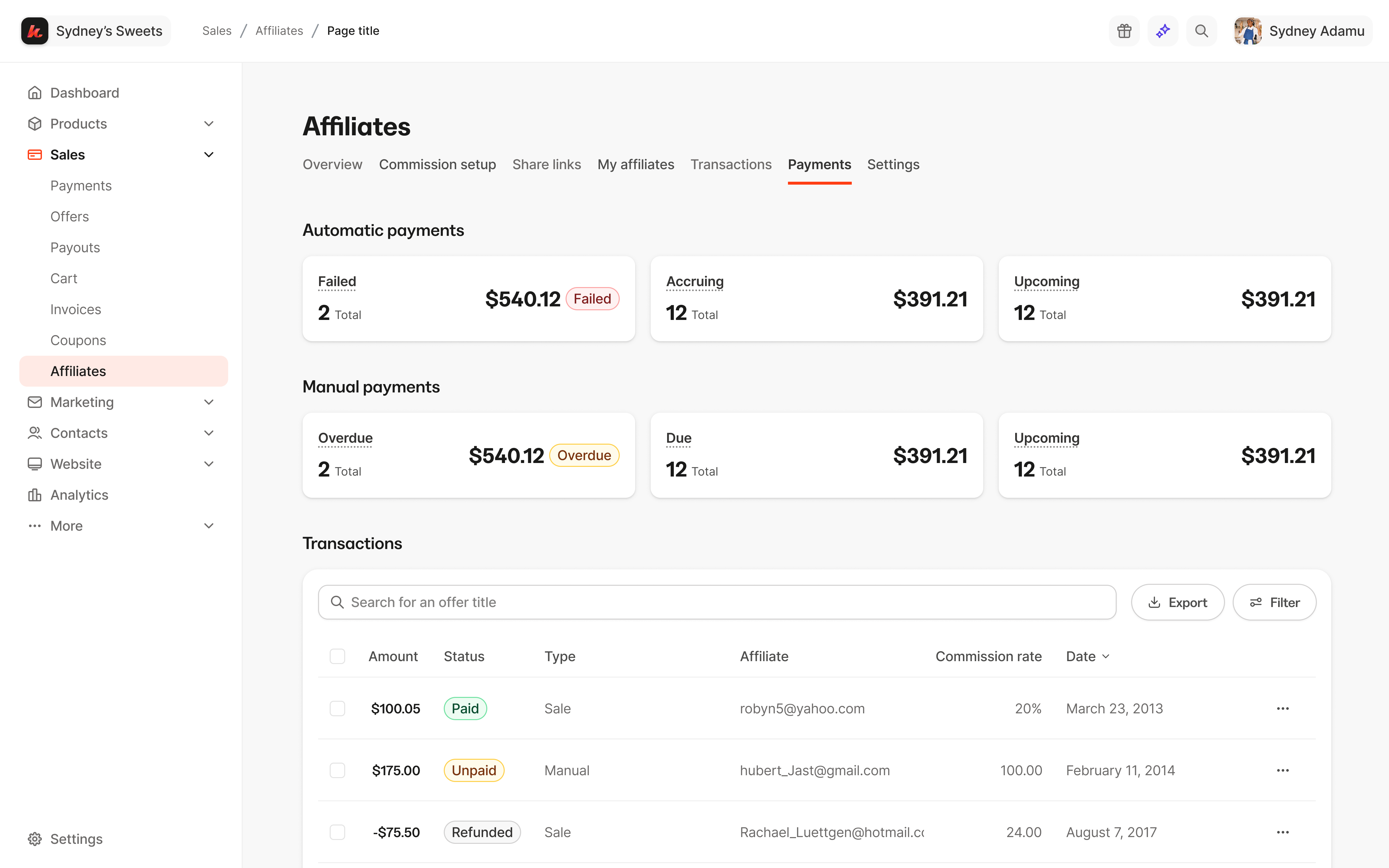
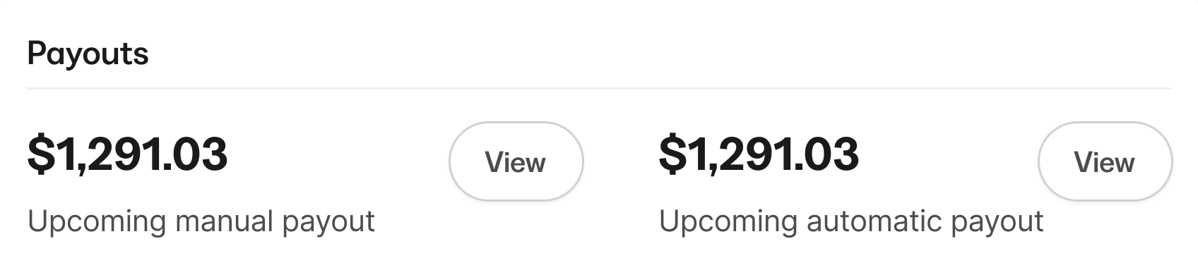
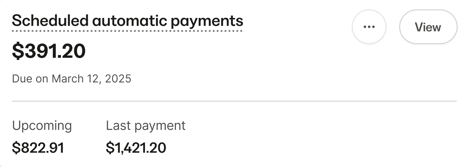
I explored a few different ways to present automatic and manual payouts.
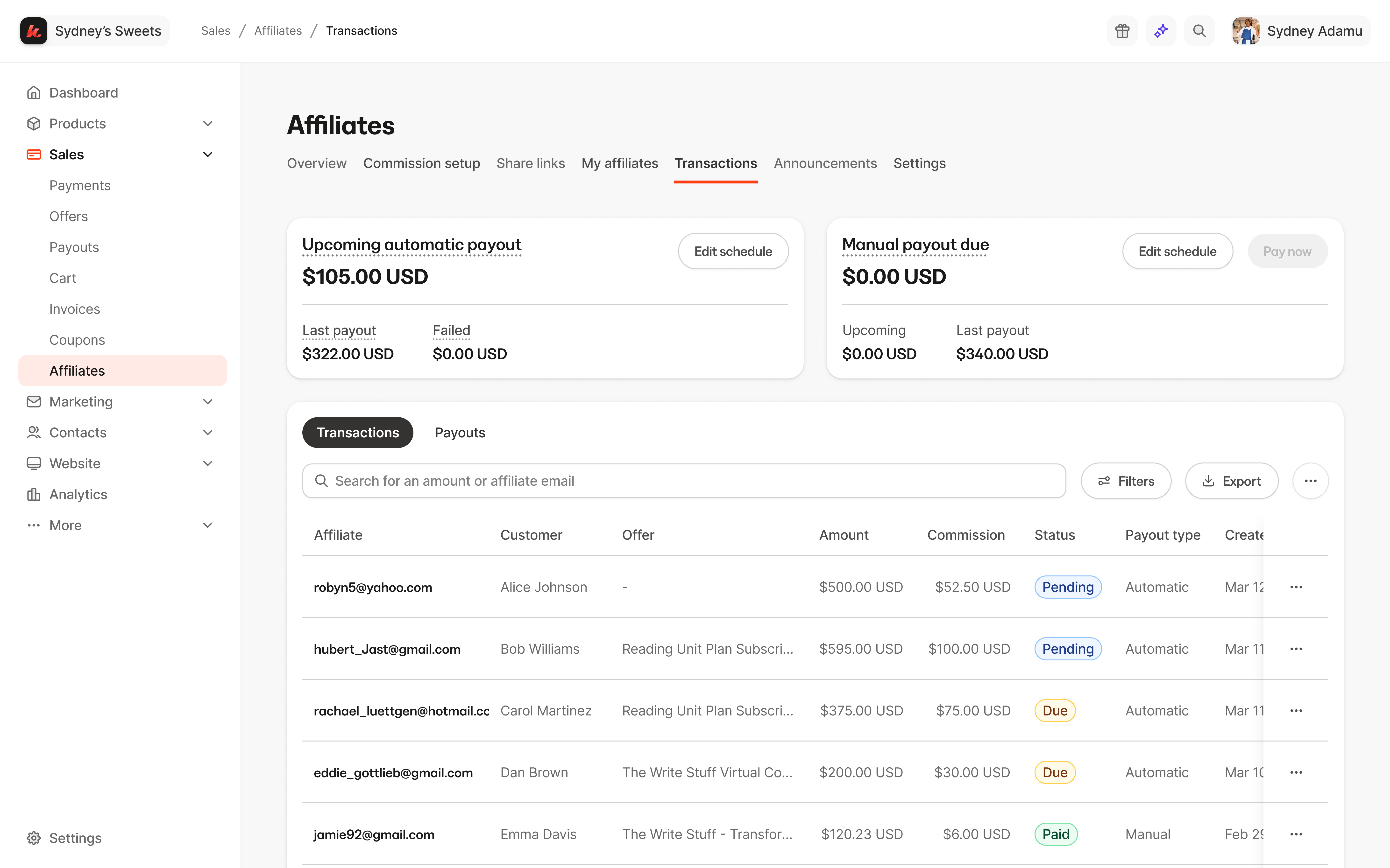
Final design of the Transactions dashboard offering quick entry points to both Automatic and Manual payout.
Key decisions
-
Design manual and automatic payouts as one system
Creators wanted both: manual payouts to keep control, and automatic payouts to automate the process. I designed one status model that works for both. Commission statuses (Pending, Due, Paid, Canceled, Failed) show where each commission stands, and payout statuses (Upcoming, Paid, Partially failed, Failed) show what happened to the money.
In manual payouts, creators can edit a commission until it’s paid or canceled, and then the status locks. Automatic payouts remove those manual steps, so the design effort went into making failures clear. When a payment fails, the commission is marked as Failed and creators can retry it or edit it, so they know when to step in.
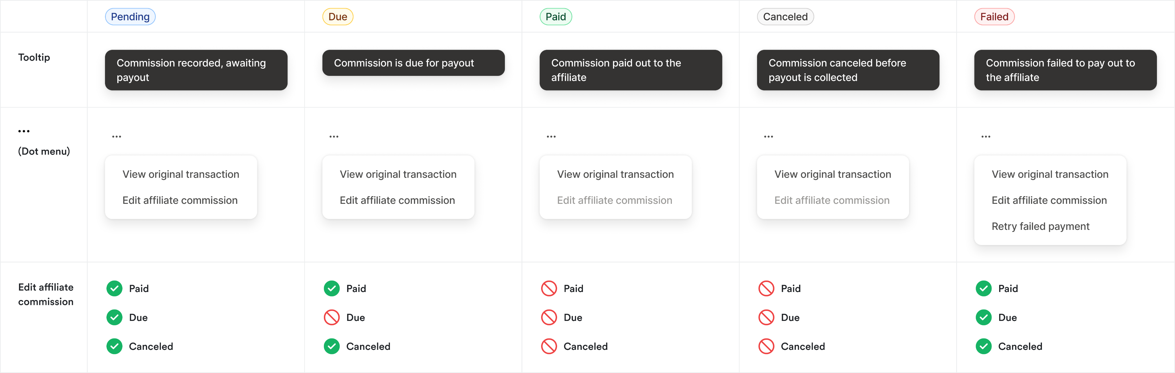
One commission status system for both manual and automatic payouts.

Payout statuses, shared by manual and automatic payouts.
Key decisions
-
“Manual payment due” becomes “Manual payout due”
I initially advocated for keeping the word ‘Payments,’ because from my perspective, the customer is making a payment to their affiliates, so I felt the term mapped more directly to the action. But after several discussions with the PMs, we ultimately decided that ‘Payments’ could be confusing because it introduces another piece of terminology for customers to learn. By using ‘Payouts’ consistently throughout the experience, we were able to create a more streamlined mental model and align it with the Payouts tab below, where customers can see a history of payouts made through either automatic or manual payout methods.
Outcome
- Creators enabled 1,000 manual payouts and 466 automatic payouts.
- Creators paid out $400K in commissions,
- The total Gross Merchandise Value (GMV) reached $4.3 million, indicating strong performance and engagement.
- We also observed a 9% growth month-over-month from September to October, highlighting the positive trend in our affiliate activities.
Reflection
This was one of my favorite 0-to-1 projects. The lack of an existing system gave me a lot of creative freedom, but it’s also what made it one of the more complex builds I’ve worked on. We surfaced a lot of edge cases as we went, particularly around automatic payouts, for example, PayPal requiring re-authentication even when a customer already had it connected, which meant some real last-minute scrambling to redesign around it. If I were starting this today, I think the real opportunity is using AI to map the system’s edge cases upfront, rather than discovering them mid-build.
jan - sep 2025
affiliate resource and bounty program
Context & Role
Aside from affiliate payouts, I also reimagined the analytics dashboard, and workflows for the creator to manage communication with their affiliates as well as a bounty program.
Added new set of metrics to the overview, such as leaderboard and top selling offers.
A bounty program letting customers set up time-bound rewards for their affiliates.
Under Settings, ability to add a memo and resources to communicate with affiliates.
sep - dec 2025
kajabi capital
Shipped Kajabi Capital, an end-to-end loan experience, partnering with Parafin.
$1.98M
Total originations
170
Loans issued
$12k
Median loan
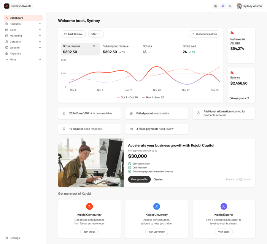
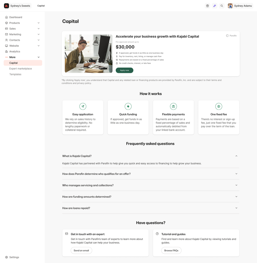
Dashboard entry point, marketing page, and mobile designs.
nov 2024
payments onboarding
Context & Role
Led 0–1 design for Kajabi Payments, our payments infrastructure. Owned onboarding for new and existing creators. Partnered with PM to drive strategy. US launch Jan 2024 — now core monetization layer for Kajabi.
58.31%
User penetration
11.77%
Increased adoption
$1B
Creator volume processed
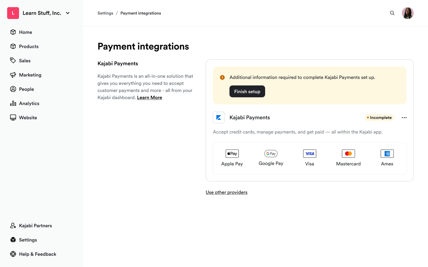
A look at the rebranded Kajabi Payments onboarding experience, where the user selects UAE, which happened to align with Kajabi's launch in the region.
Problem
-
Split across two products
The onboarding experience needed to hand off seamlessly to Stripe to complete business and identity verification (spanning two separate products), not one flow fully within our control.
-
Lack of guidance & help
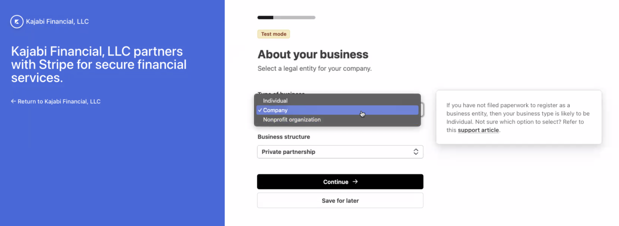
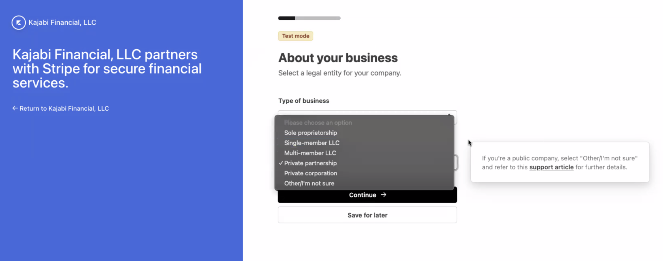
Stripe gave barely any education about which business type/structure to choose from. If customers put in the wrong business information that doesn’t match IRS or local corporate records, Stripe’s automated verification system will reject them and will trigger a verification hold on their payouts. CX receive around 9 requests per month to remedy crucial portions of onboarding on behalf of the customer.
-
Fragmented experience
Current onboarding was fragmented and non-linear. Customers connected Stripe first, got bounced back to Kajabi with “incomplete setup” errors, and often never finished — thinking they were done.
Key decisions
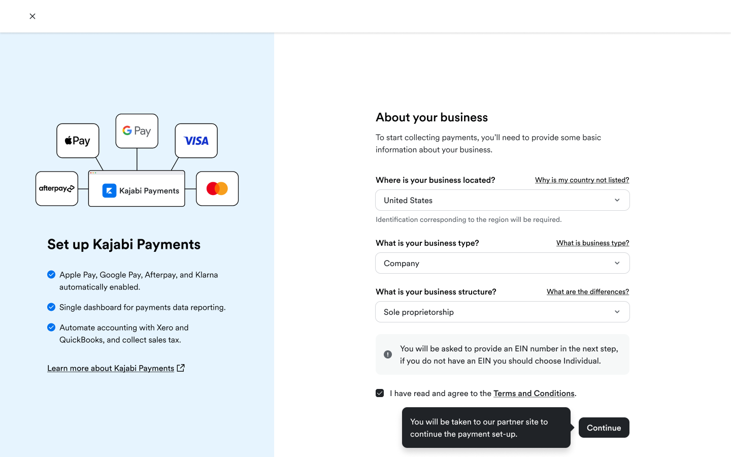
- Swapped the order: business info + contextual help on business structure + T&Cs before Stripe connect, instead of Stripe first.
- Bundled similar actions together to reduce steps and cognitive load.
- Made Stripe signup the last step, so users arrive with everything ready.
Tradeoff
Asking for more info up front risked drop-off, but context and guidance reduced confusion enough that completion went up.
Outcome
- 58.31% penetration, surpassing Stripe by 21%
- $1B+ creator volume processed
- 11% lift in KP adoption from the redesign, fewer CX tickets on onboarding
- New customers now default into KP with fewer objections; live across CA, GB, AU, UAE, EU
Reflection
If I could do it again, I’d scope the first 30 days post-onboarding into the project from the start, including the monthly payout banner we designed but didn’t ship due to timing, since communication about when money arrives is just as important. Onboarding isn’t a funnel with an exit; it’s the first chapter of the product relationship.
2024 - 2026
payouts
Designed to support multiple bank accounts as well as instant payouts.
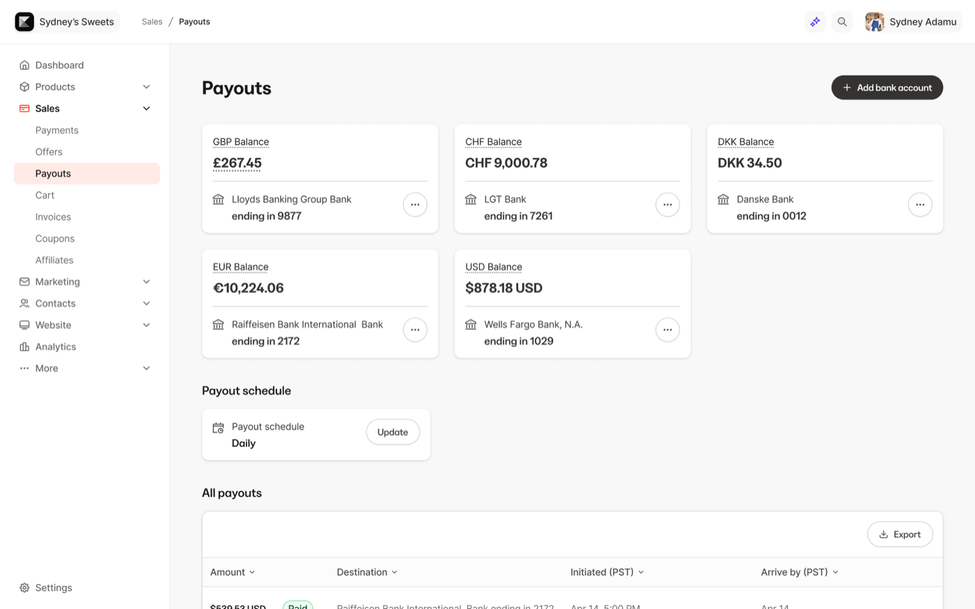
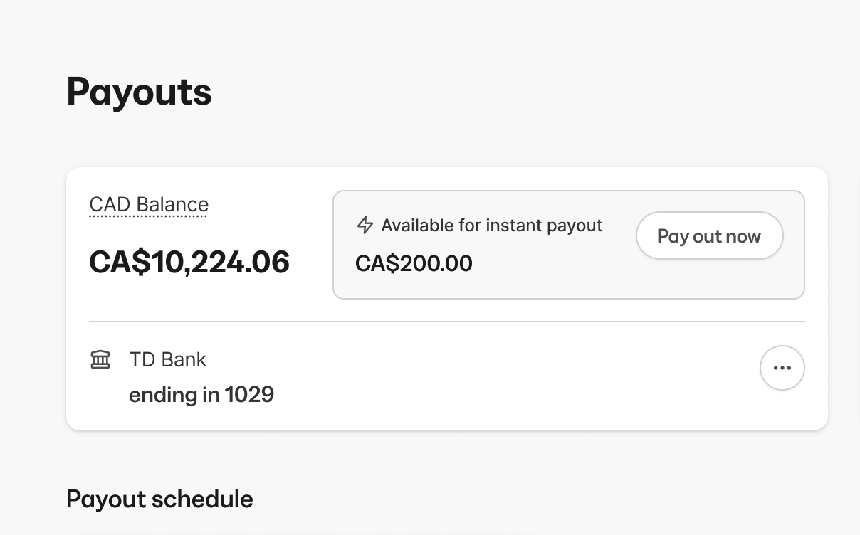
On the left shows multiple bank accounts, and on the right is the instant payouts feature.
sep - nov 2024
disputes
Created a system for customers to manage and take action on disputed payments.
18.87%
Dispute win rate
39%
Increase over prior win rate
Disputed transactions at various stages.
sep 2023 - nov 2023
analytics
Context & Role
As the product designer on the Commerce team, I drove the research and design for Kajabi’s Payments overview page, partnering with PM and Engineering on implementation and rollout.
The redesigned Payments dashboard.
Problem
Current Payments dashboard was lacking in terms of features. Engagement with the dashboard was low. Customers have reached out requesting additional functionality such as Total Sales, best-selling Products & Offers, and LTV for a customer. They were also confused about how to navigate to the Transactions, Subscriptions, and the Multi-payments page from the current design. With our redesign, we want to improve the usefulness of the payments dashboard, increase engagement, drive return visits to the dashboard, and improve CSAT.
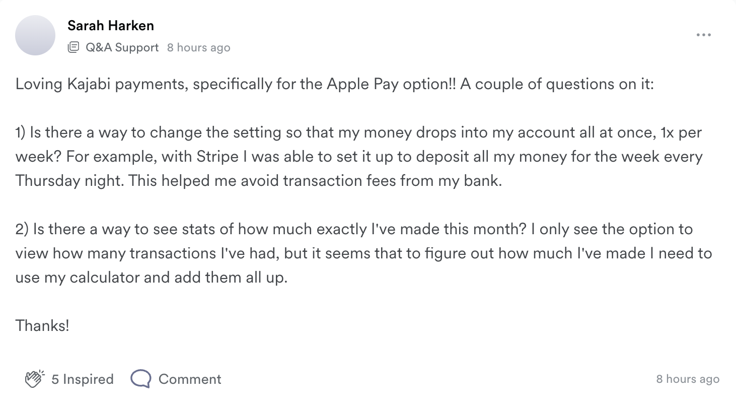

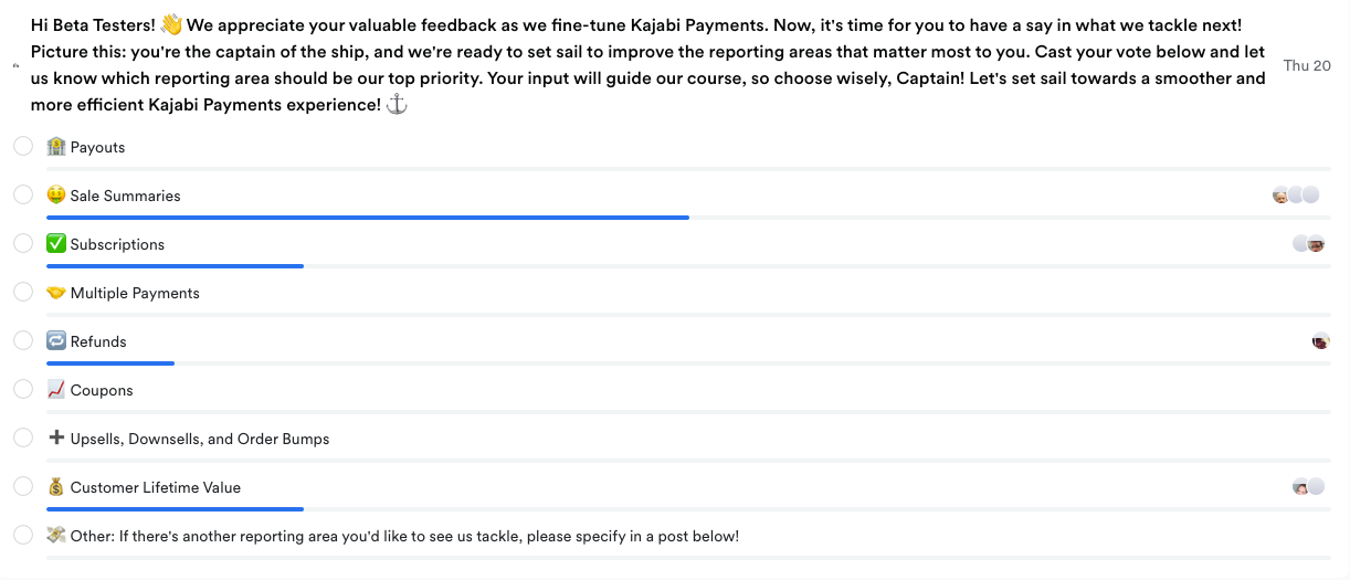
Findings from our poll survey: gross sales and future revenue from subscriptions are the most requested charts.
Key decisions
- Use a modular redesign approach with swappable data viz components that allow for a phased rollout instead of an extensive redesign.
- Display relevant, useful, and actionable data such as customer lifetime value and failed payments.
- Provide a clear navigation for users to easily access different types of payments.
Research
From 10/16 to 11/10/23, I ran moderated interviews with 14 experienced creators ($60K+ revenue, mix of Kajabi Payments and Stripe users) evaluating the new prototype against the current design. My PM also sat in and observed the interviews. The interview sessions also turned out to be a great co-creation experience with our customers, walking them through the prototype let us pressure-test whether the design mapped to their expectations in real time, and their reactions fed directly into the next iteration of the work.
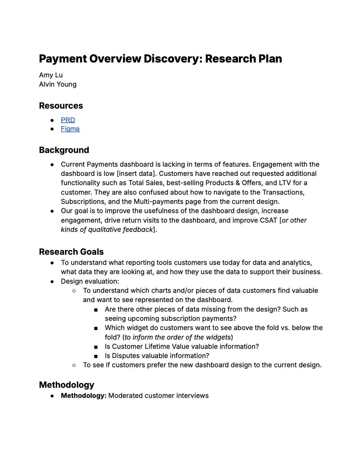
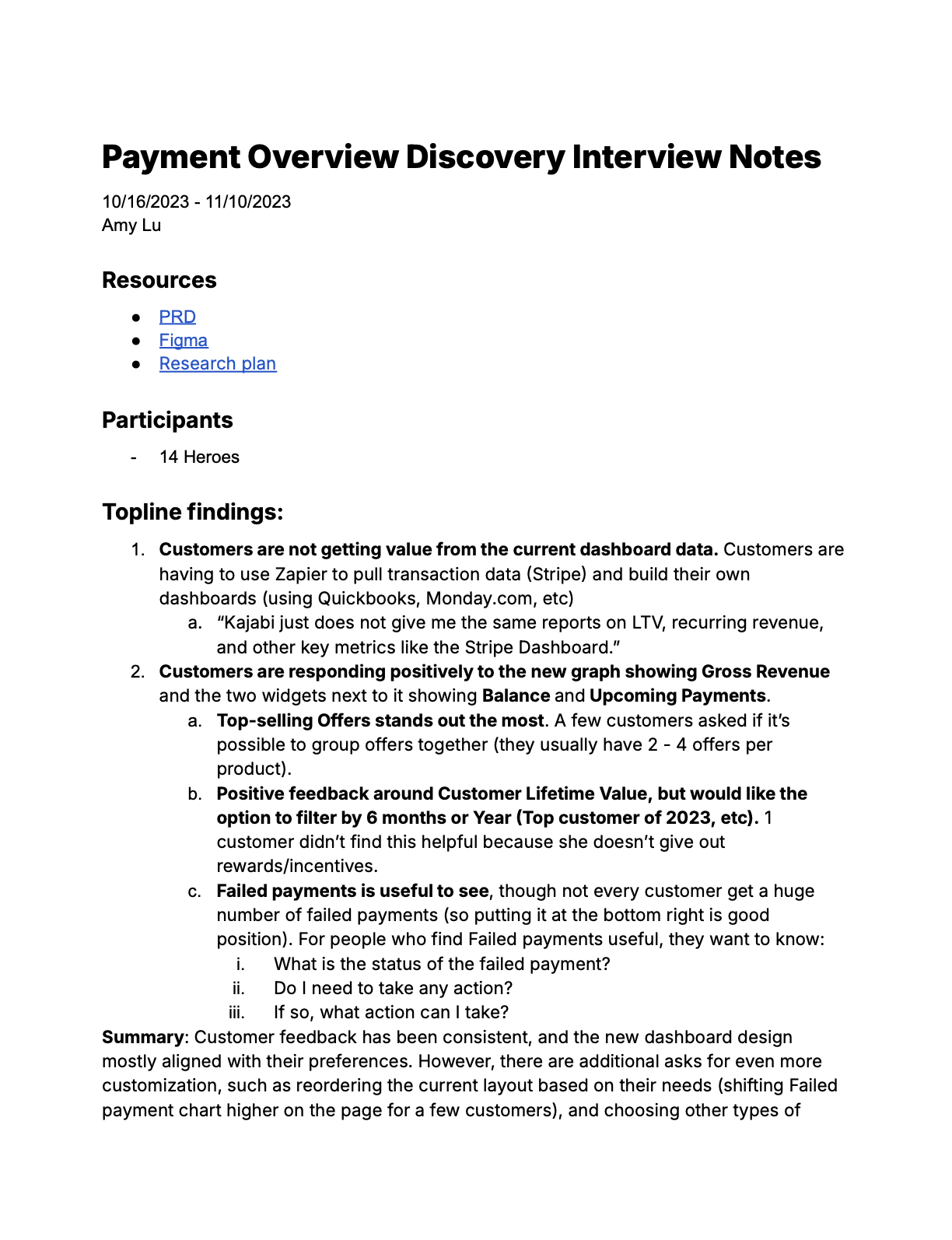
Screenshots of the research plan and the summarized notes from the interviews.
Key findings
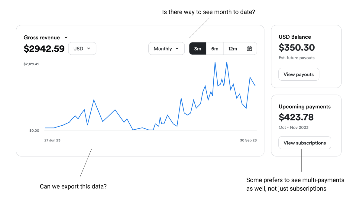
1. Customers are responding positively to the new graph showing Gross Revenue and the widgets showing their current balance and upcoming payments.
“I love that [upcoming payments], b/c I’m always planning for the next month. If anything further than that, it’s relying on something not realistic.”
“Upcoming payments is great. I have multi-payments, memberships, recurring subscriptions, I often don’t know what’s coming in.”
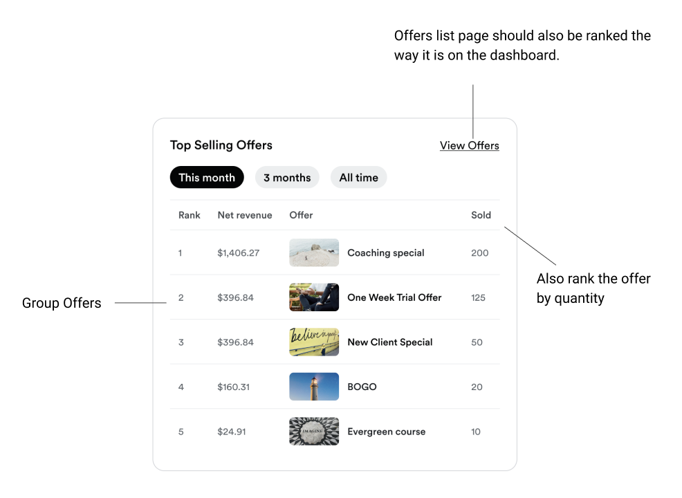
2. Top-selling Offers stands out the most.
“This helps to keep our perspective on what’s selling now, what’s popular. We are always looking for ways to optimize the user experience.”
“Top offers would be good add-ons to other purchases.”
“[This] tells me which offers to be focusing on. If I have offers that are lower, I can adjust accordingly.”
“Can we group Offers together?” Ex: he has the same product but different offers for different months (mastermind for July/August), he wants to be able to group the offers together and see how this product did overall.
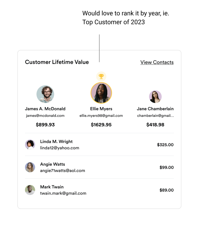
3. Positive feedback around Customer Lifetime Value, but would like the option to filter by 6 months or Year (i.e. Top customer of 2023).
“It tells me who are my contacts, are there certain traits these clients have in common, and how can I use this information to find more clients.”
“It would be nice to see last 6 months, 12 months as well. A customer could’ve only bought everything in the first 2 years and always be at the top of the list.”
“If a customer spent 10k they might’ve left. [I] want to see [who’s] the top this year.”
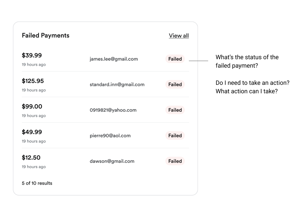
4. Failed payments is useful to see, though not all heroes experience a significant number of failed payments in their lifetime.
For those who find failed payments useful, they want to know:
- What is the status of the failed payment?
- Do I need to take any action?
- If so, what action can I take?
Reflection
Doing this research gave us conviction: all 14 participants preferred the new design, so every decision after that was backed by evidence instead of opinion. I also presented the findings to leadership, which turned the research into shared design visibility for the org, also builds credibility for the team.
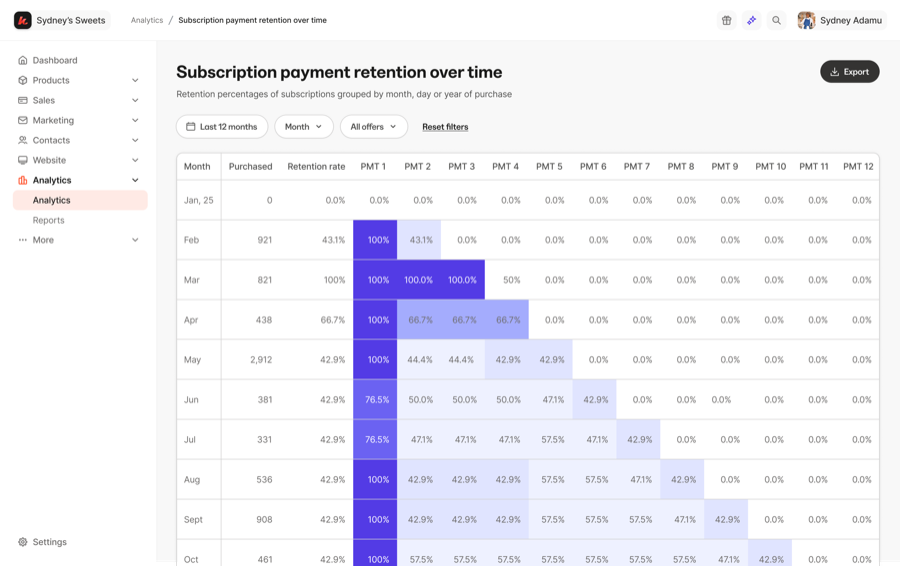
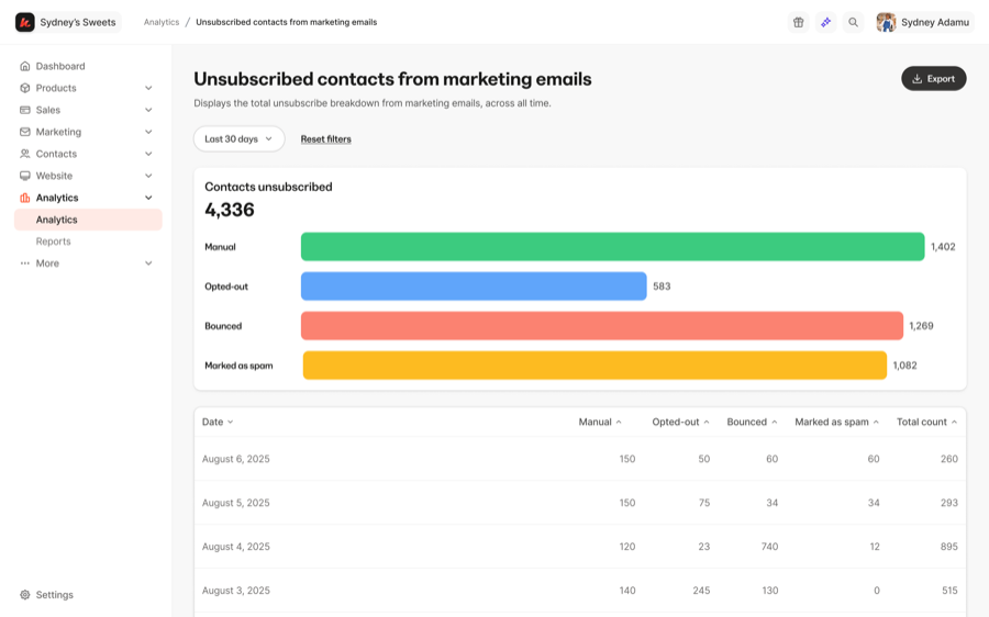
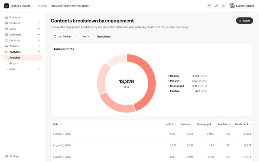
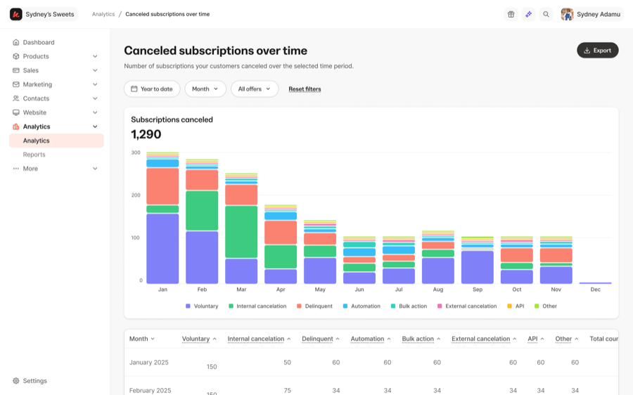
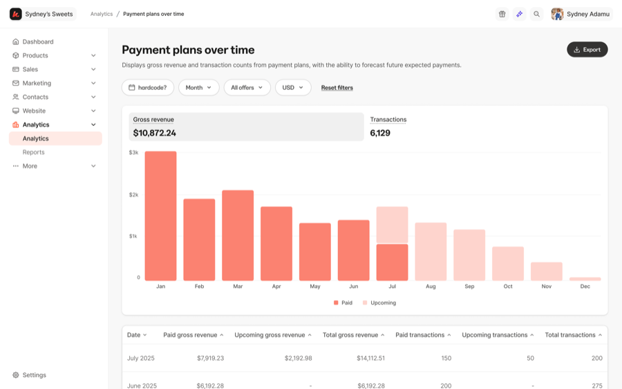
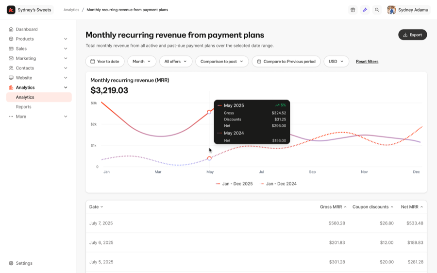
Some of the data visualization charts I designed for the Analytics team.
nov - dec 2024
transaction details page revamp
Redesigned the transaction details page's hierarchy for clearer, easier scannability.
A snapshot of what a customer sees after clicking into a sale, with the full breakdown of that purchase.