Under the guidance of Professor Jason Hong at Carnegie Mellon University, my teammate Rosie and I redesigned and built out a website that showcased what data third parties collect and why. My role in this project was redesigning the visual interface as well as the data visualization of the website. Rosie handled the implementation using Angular.
Many smartphone apps gather and send lots of sensitive data to various third parties around the Internet. However, it’s hard to know exactly what data apps are sending out and why. Having this kind of information would be helpful for privacy, in terms of informing the public, journalists, and policy makers.
Our first steps was each conducting a heuristic evaluation of the current website, followed by initial brainstorming of the data visualizations and user testing.
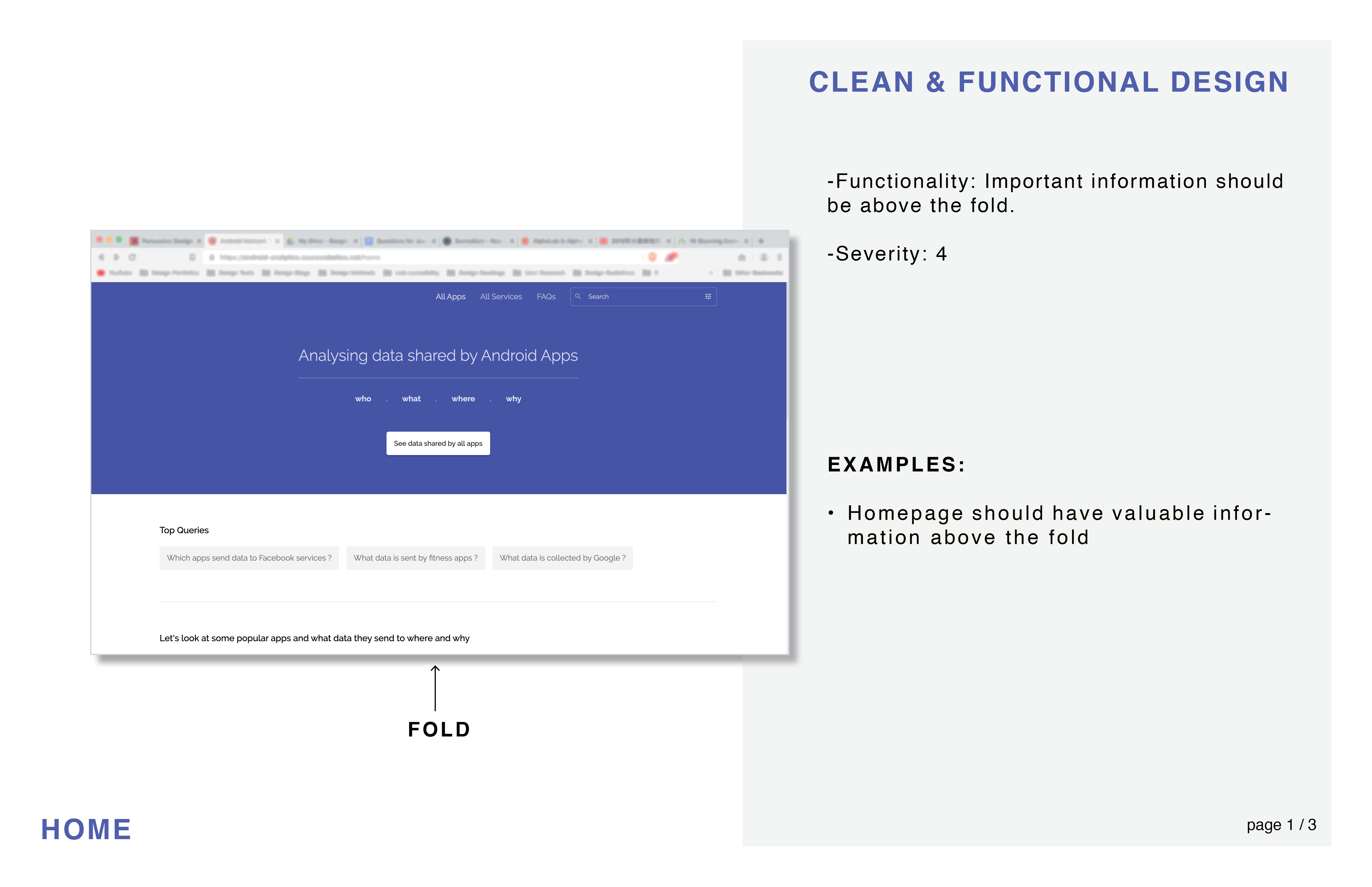
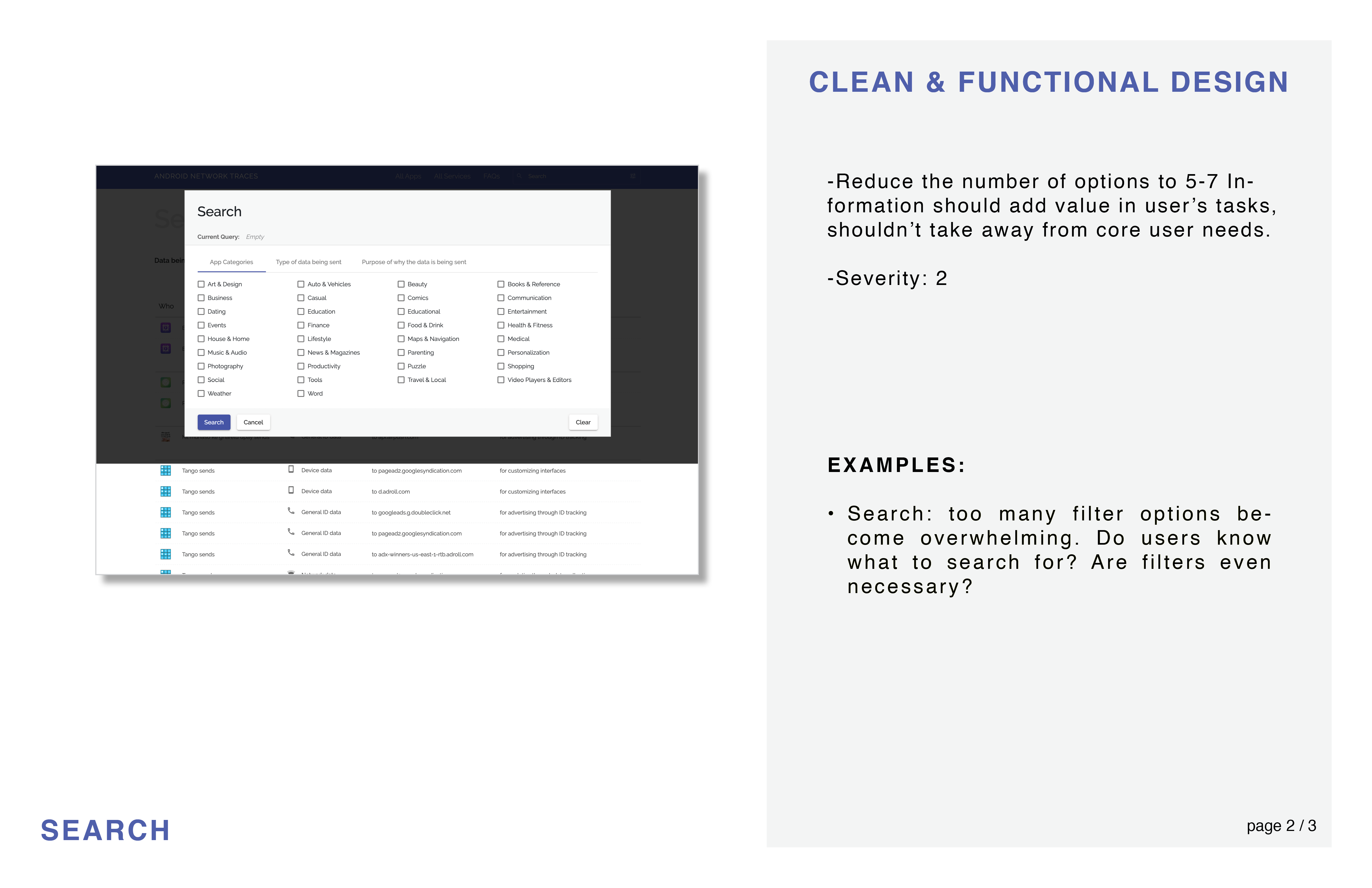
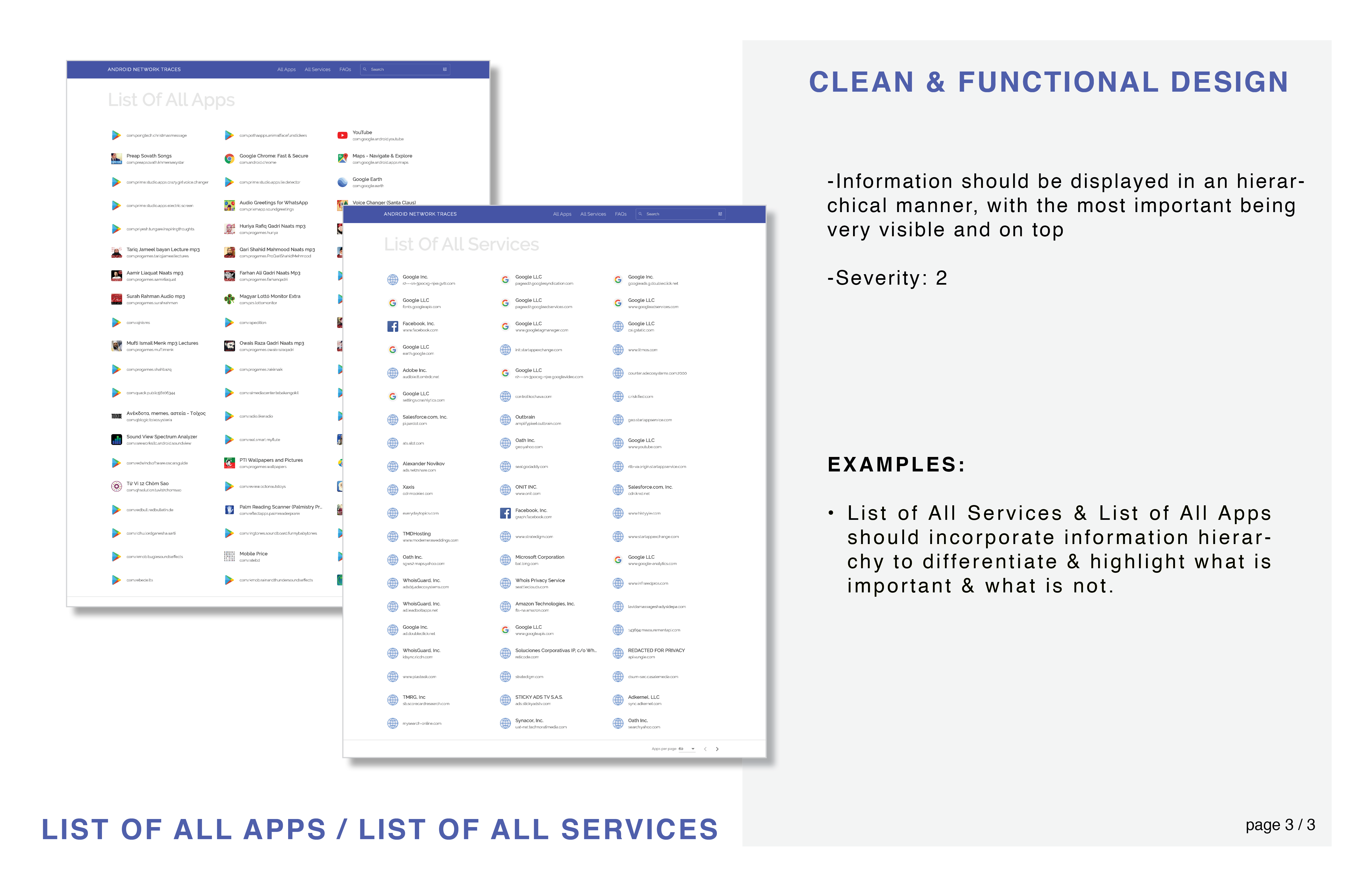
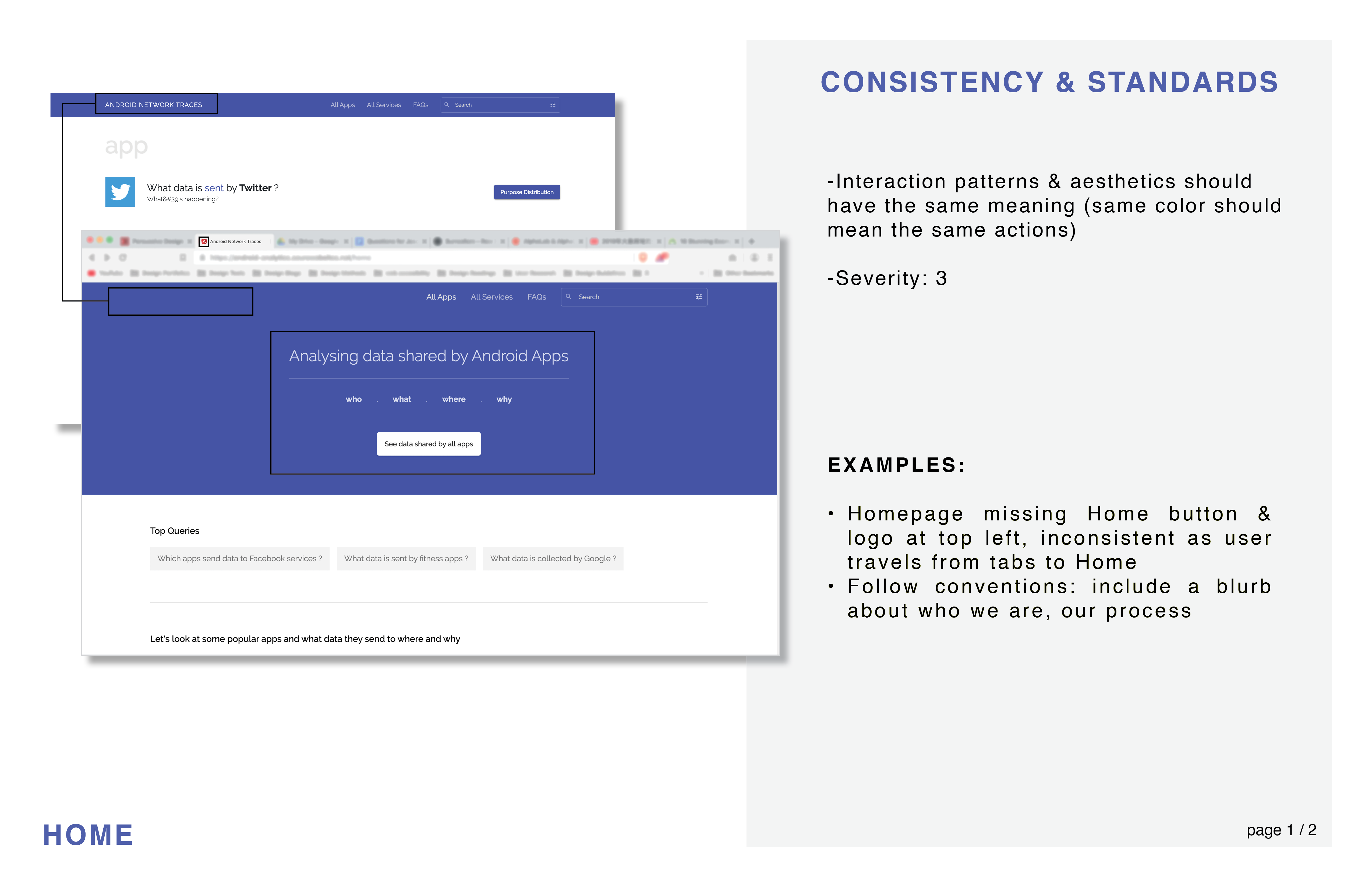
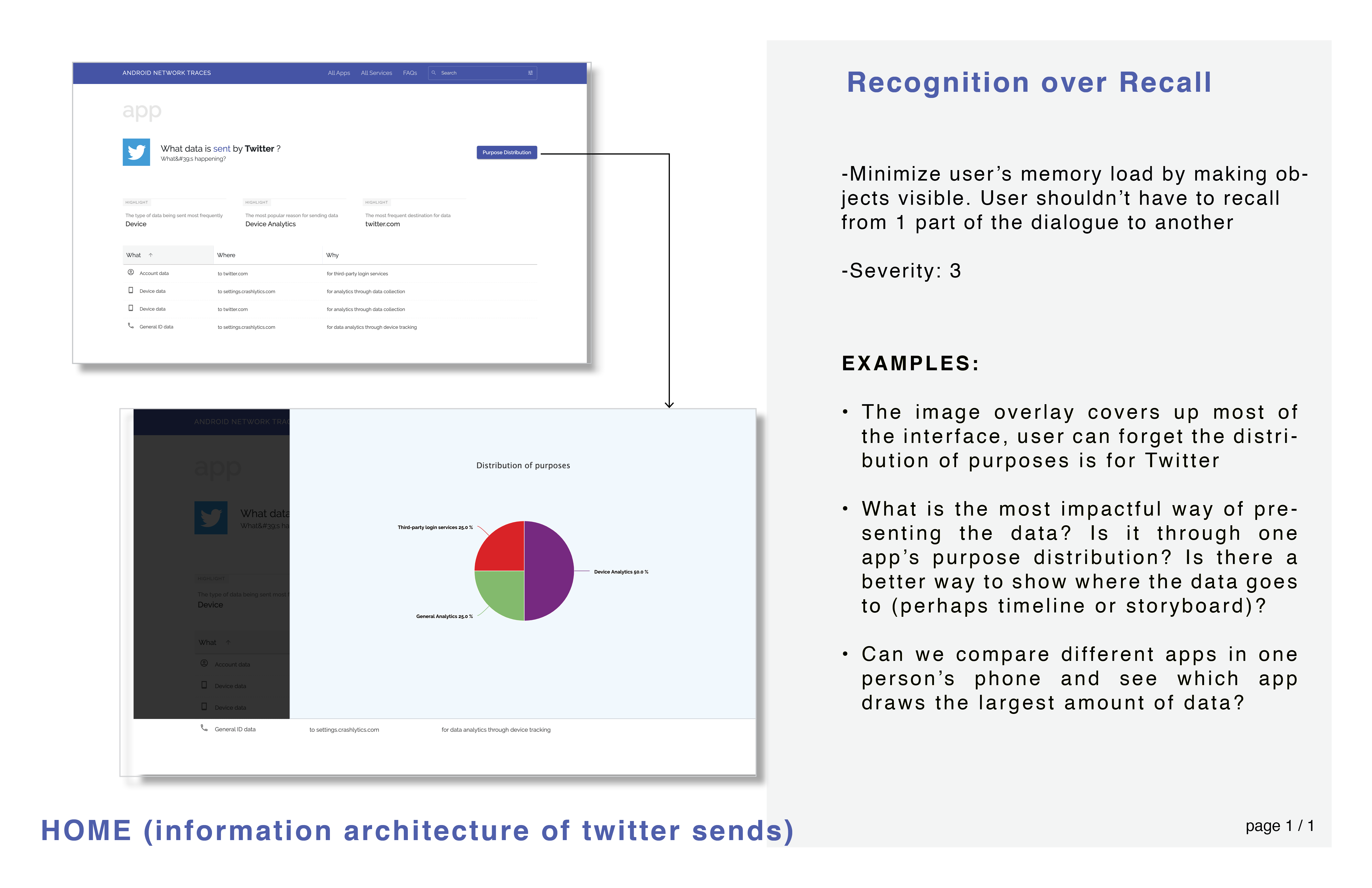
The Heuristic Evaluation discovered a lack of clean and functional design. Things were overly cluttered, and lots of information were repeated, thus preventing the user from easily finding the information that is pertinent to them.
Better data visualization to answer the questions people might have about their data: why do apps collect their data and why.

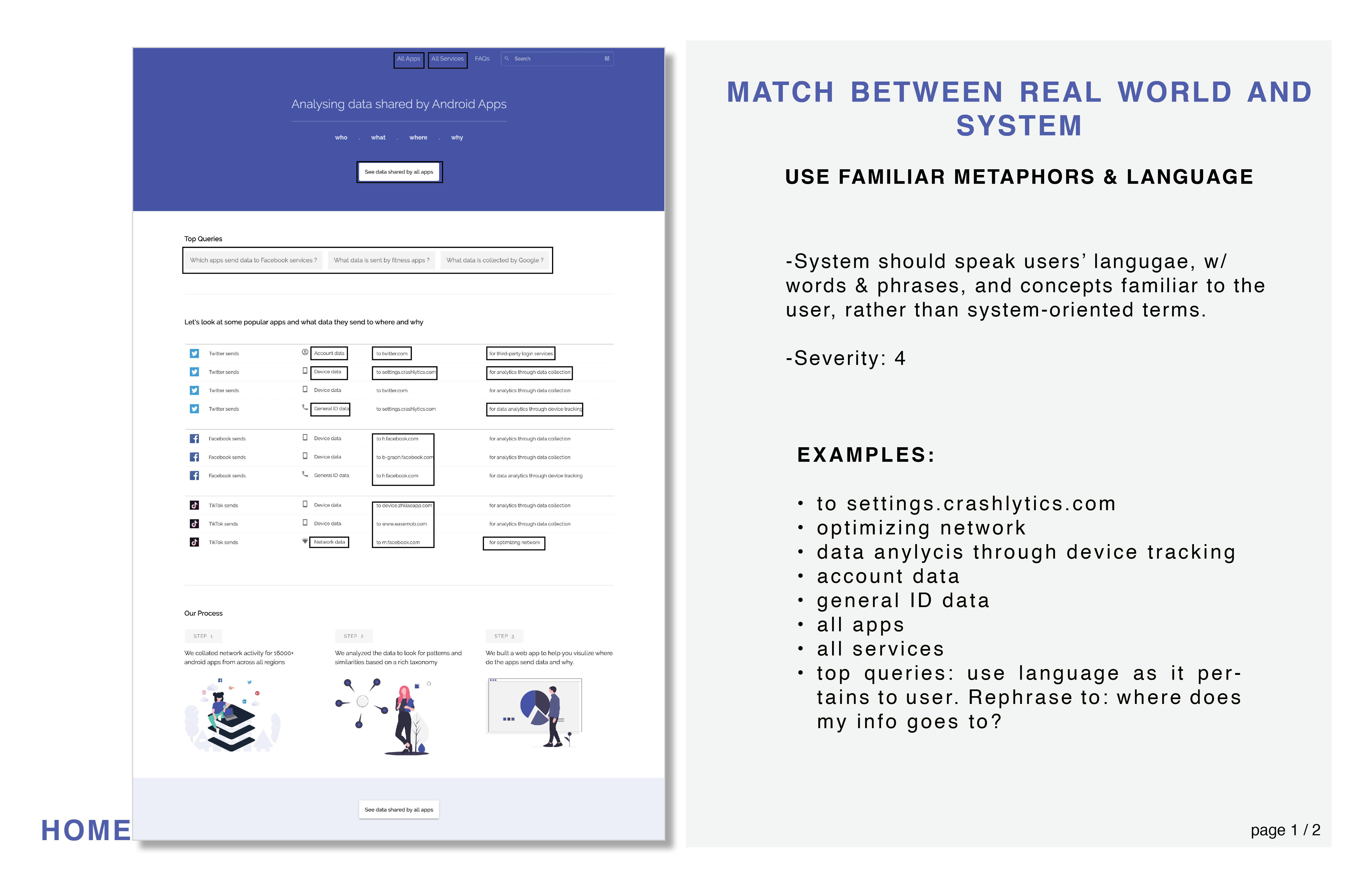
Homepage need to explain the purpose of the site. It should present interesting insights and findings as well as how we analyzed and classified the data.

Clearer interaction flow of pages.

Integrate our site stylistically with Privacy Grade (our website is a subside to Privacy Grade).

After establishing the problems, I needed to tackle the data visualization.
To make sure our redesign addresses the right questions, we started off reading papers, articles, familiarizing ourselves with data privacy and security.
We read the Mobipurpose paper by Haojian Jin, a PhD student at CMU whose paper served as the source for the data used in this website.
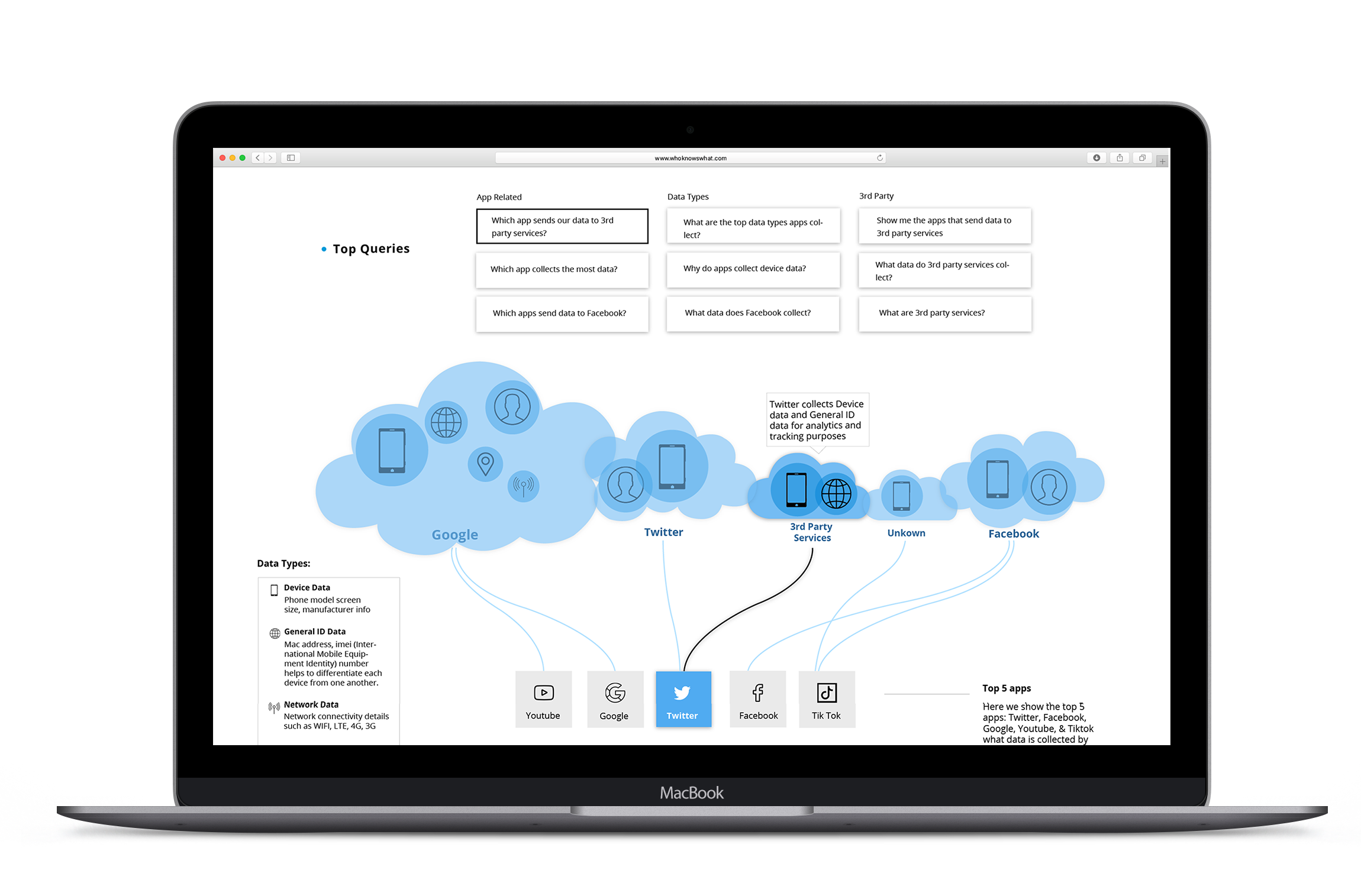
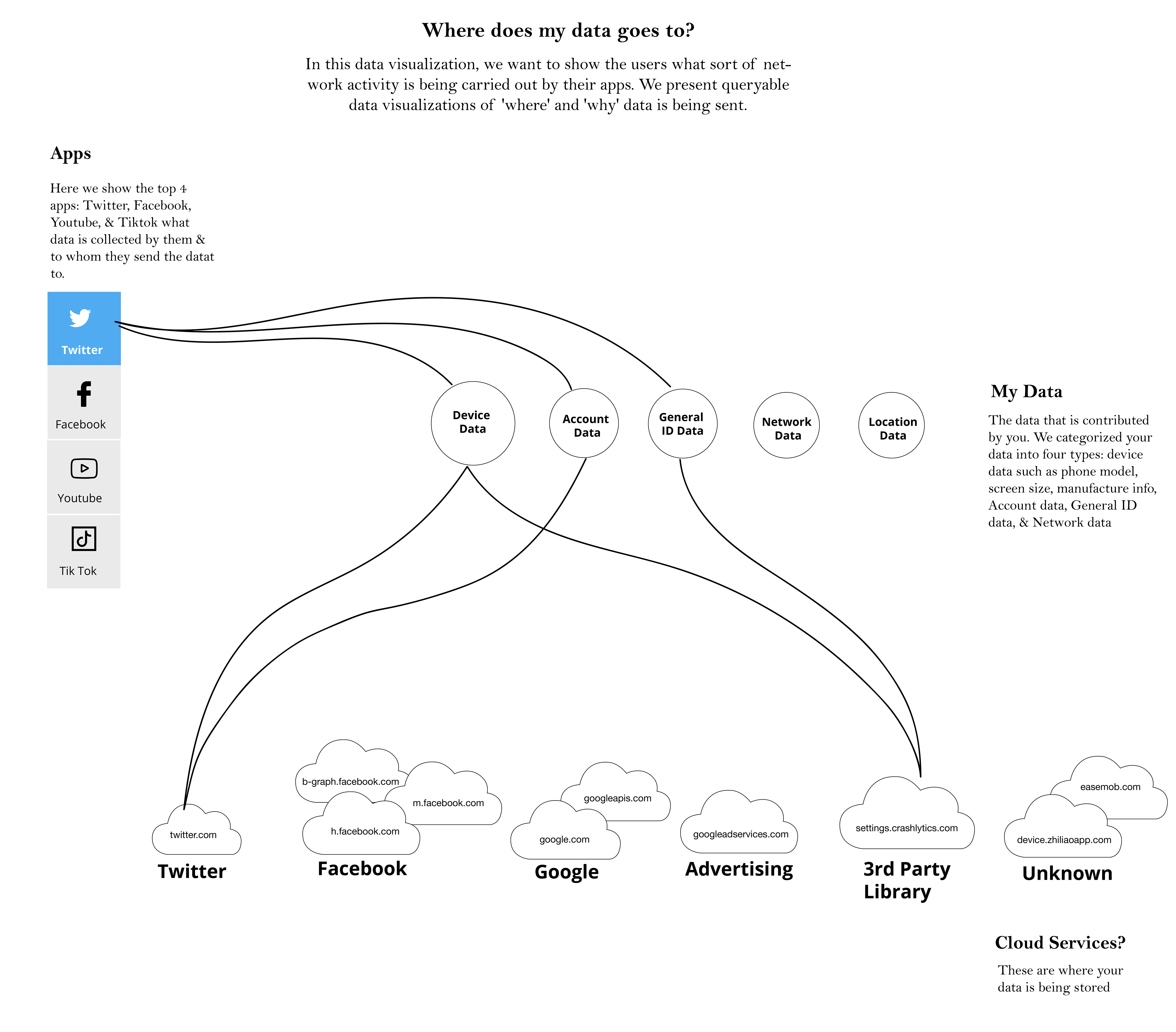
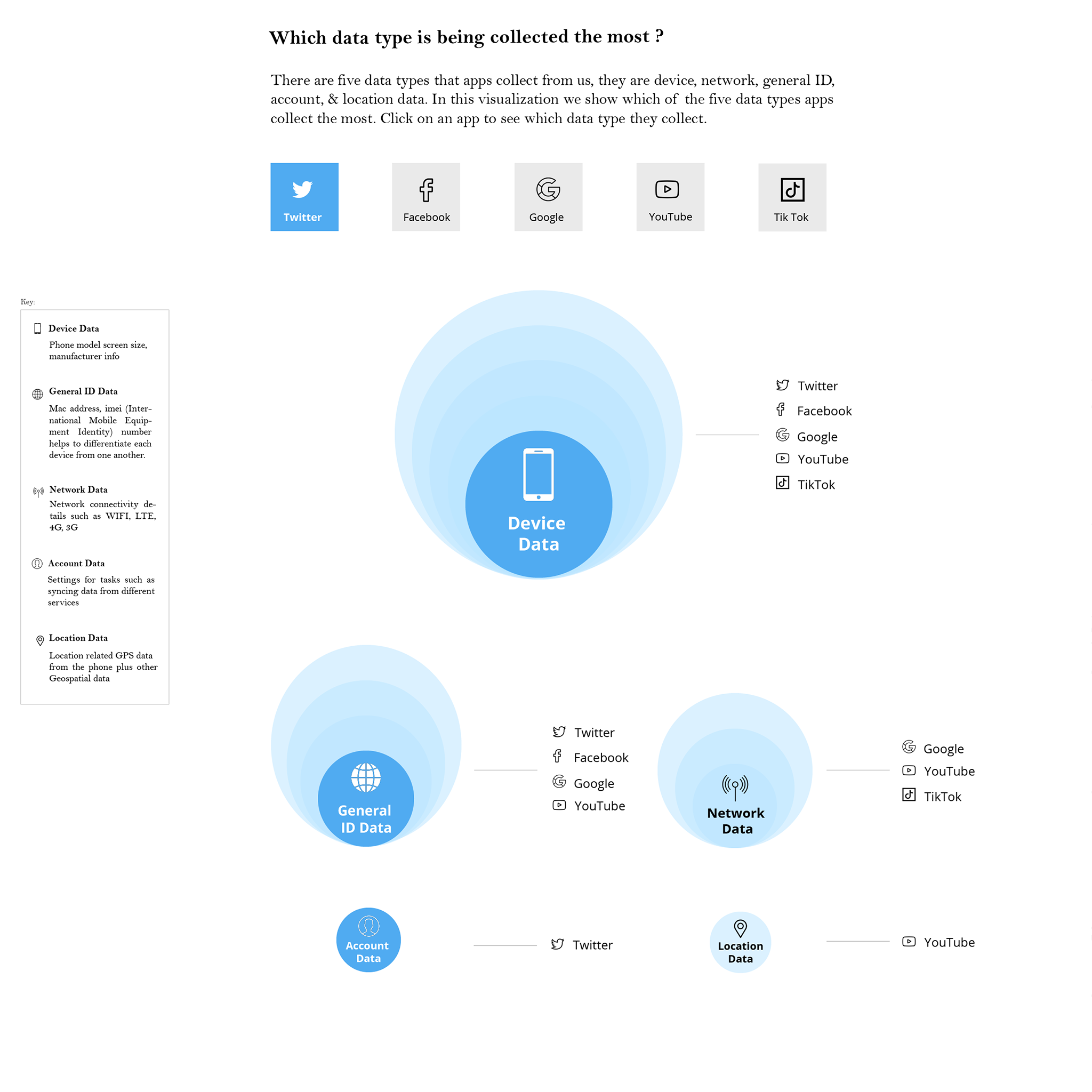
I separated the data viz into 2 views, where in one view I show the top 5 apps, and in another I show the top 5 data types.
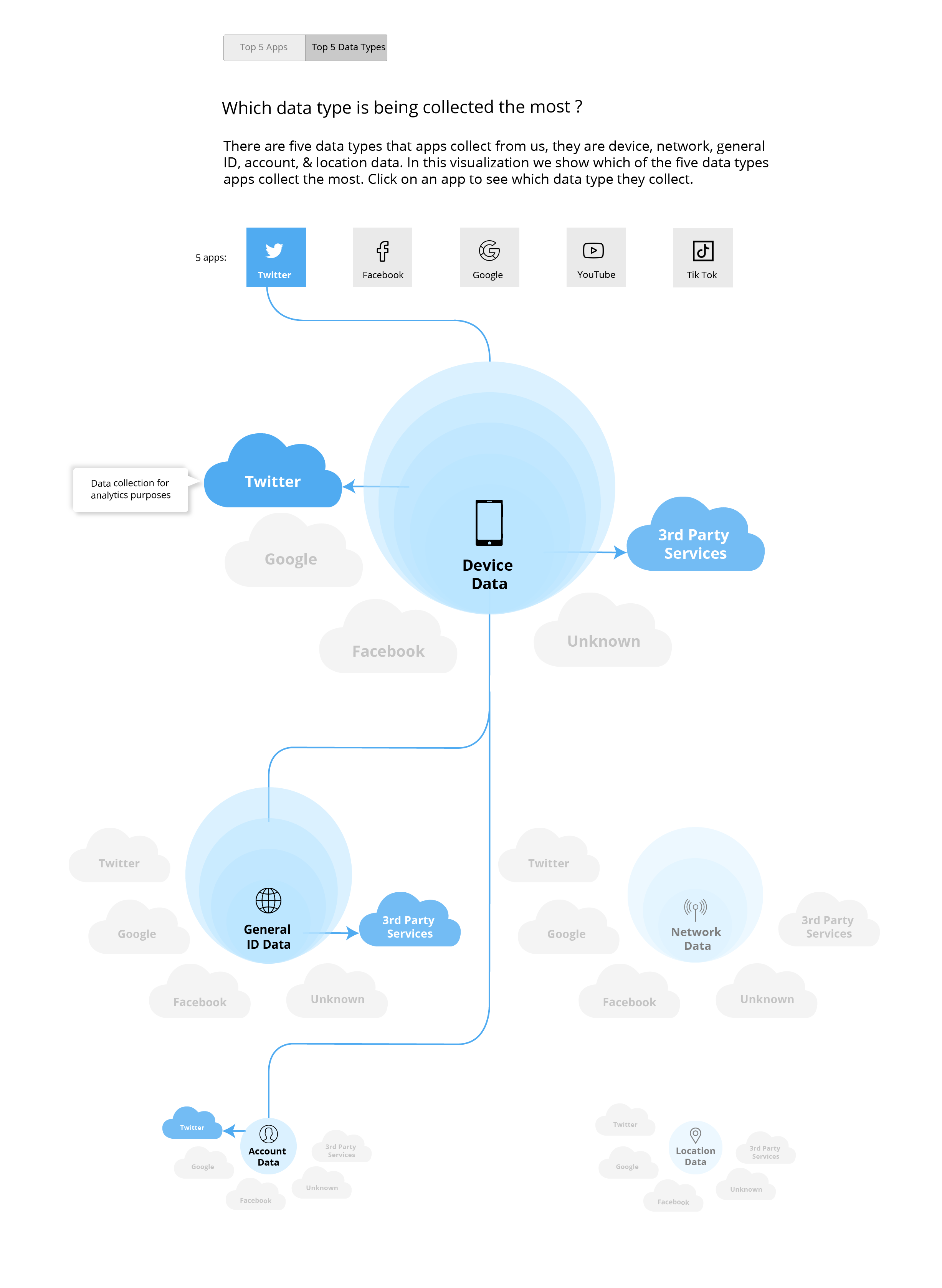
I received some feedback regarding view 4 and 5. Users felt that view 4 is more visual, yet the multiple sized clouds are confusing, and it’s not clear why the data types are sized differently. But it is easier to consume and understand view 5, which had many repeated data icons.
I continued to iterate on view 5 based on user feedback while brainstorming the other views (6-9).

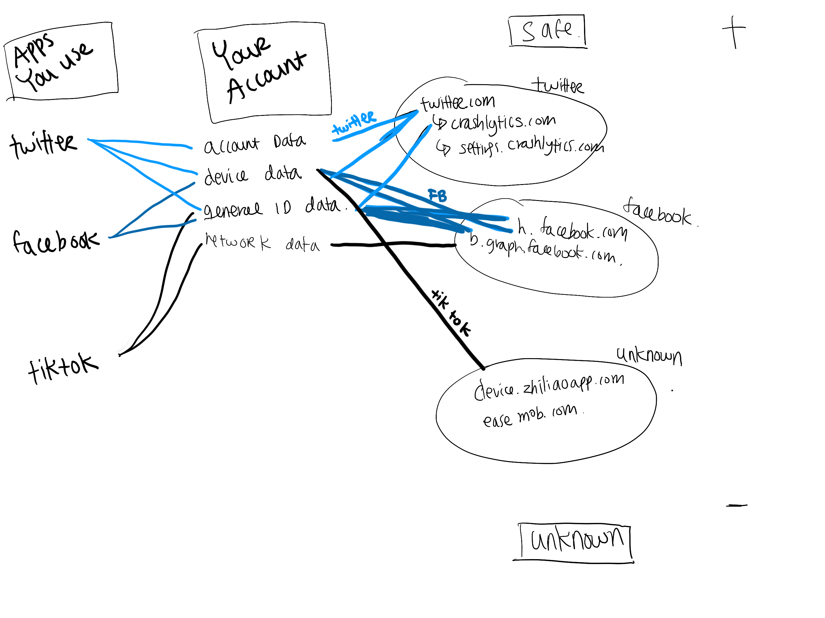


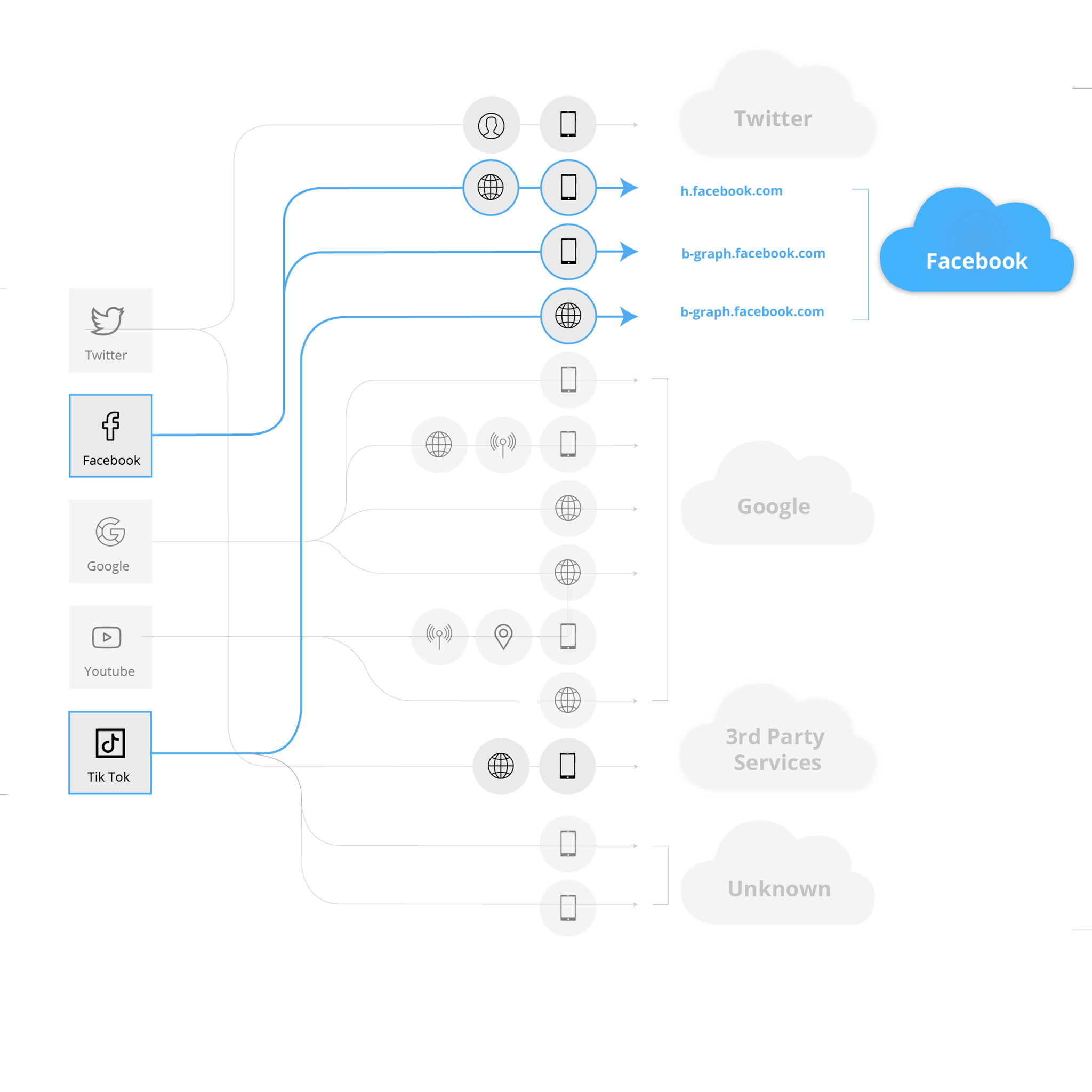


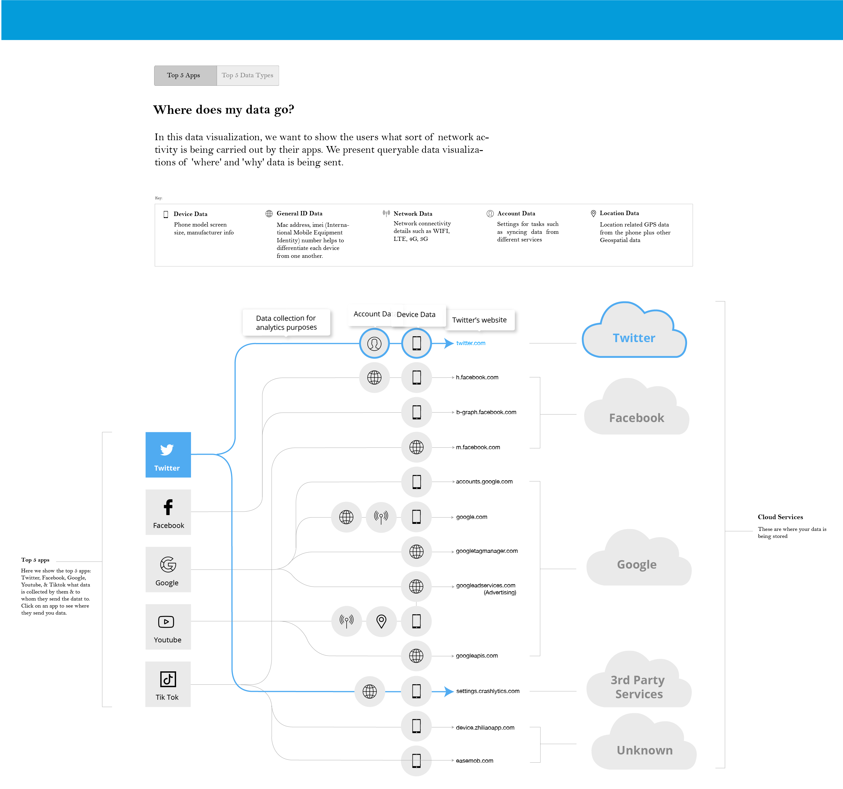


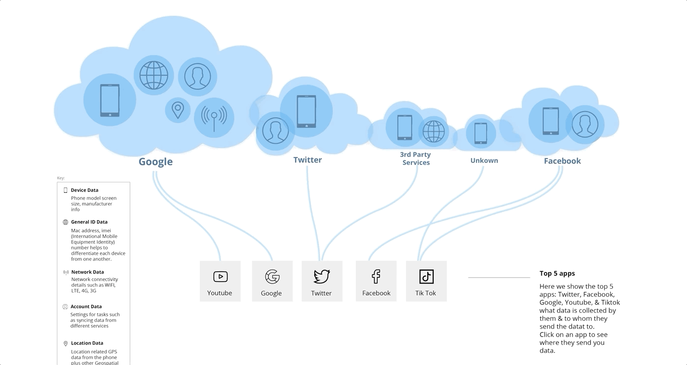
The final iteration used a brushing and linking method that combined two views into one, enabling users to explore details within the dataset.
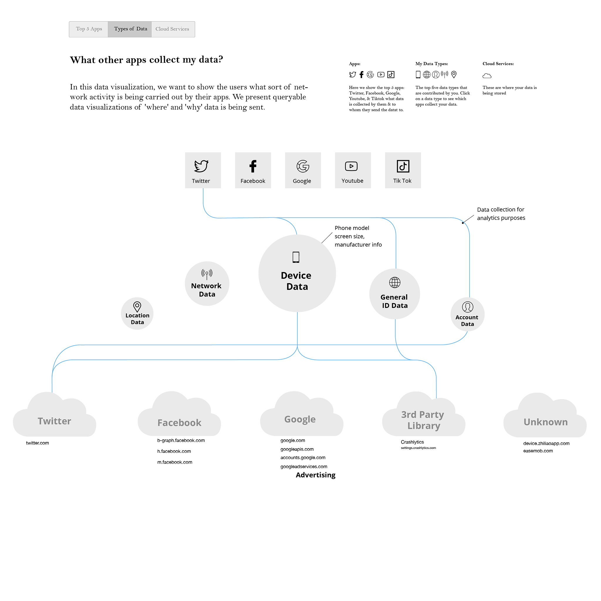
Instead of splitting the views into 2, I used a tree-map view to display the data of what the top 5 apps are sending to the clouds. As the user click on a cloud, they can view detailed information such as the exact address of where their data is going.
I create a style guide based off of Privacy Grade’s website to guide the style of our site. Since our site is a subside to Privacy Grade, our Professor wanted to make sure the styles of the two sites matched.
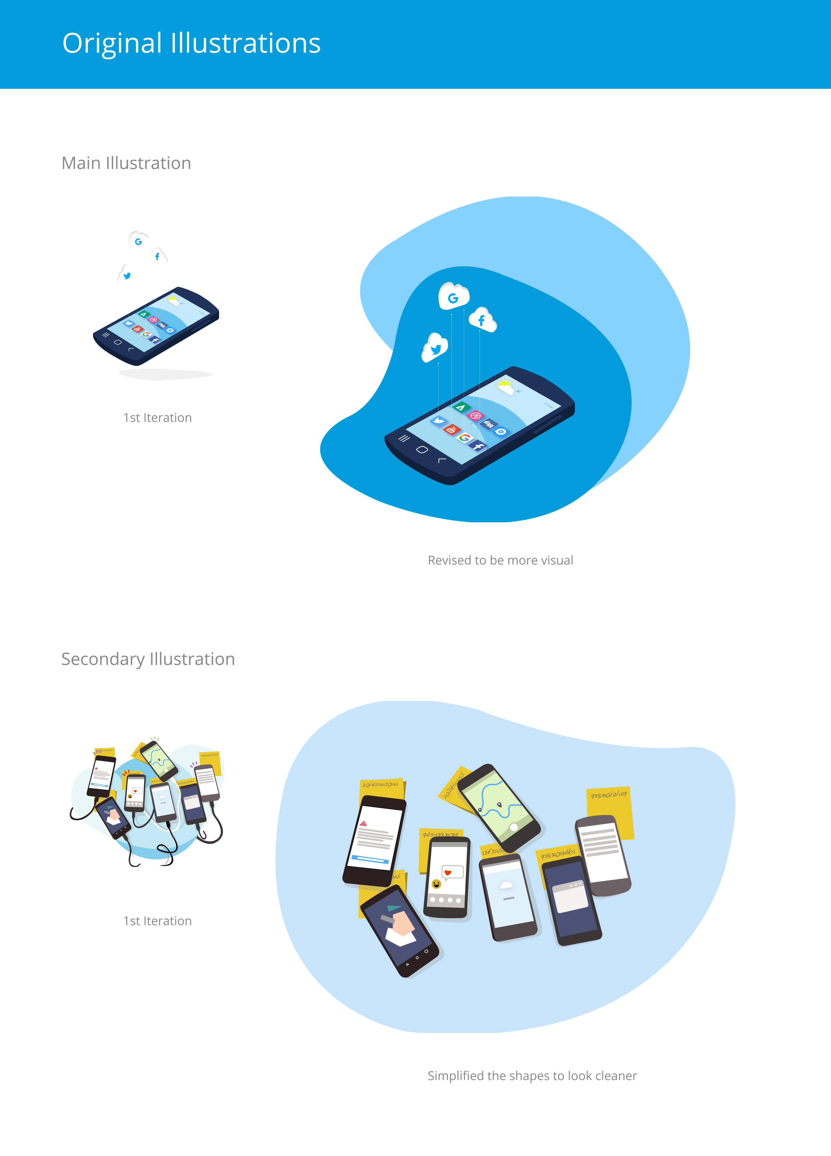
I also created original graphics in Adobe Illustrator, potentially to be used on the Homepage or FAQ page.

01
Initial Design

02
Linear graph view

03
Playing with varied grid layouts

00
Old Design

04
Final Design

Our professor was very happy with the end product, and are aiming for deployment of the web site in January 2020. We believe the website is successful in educating people about the types of data apps are collecting about us and why. We hope this information will raise awareness for the general public about data privacy and security.
This was a great learning experience for me as well in terms of learning data drive design to convey information that is coherent and cogent. Also, working with fellow teammate who is a developer helped me gain empathy and collaborative skills to make an impactful product.